I had freeze-dried coffee at home and wanted better milk foam, so while I was pushing a cart around the store I asked a very boring question: which carton actually whips into microfoam with a cheap electric frother. That answer led to matcha. Then coconut milk went in the cart and the question changed again, to what I could make with coconut milk, coconut water, coffee and matcha. By the checkout line there were nine drinks and I was arguing with myself about what a menu for them should look like.
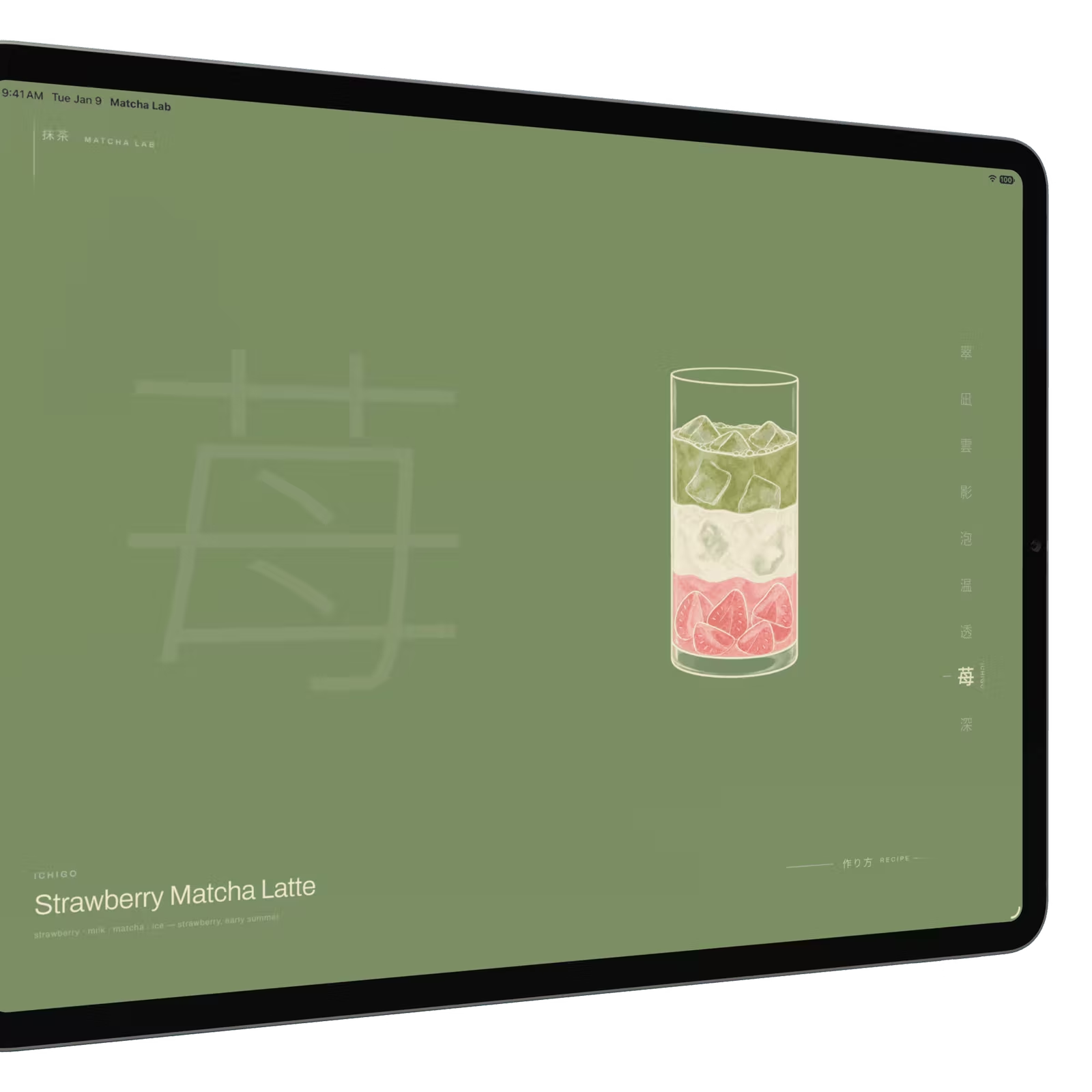
Matcha Lab is what came out of that. Nine matcha drinks on one screen. You swipe between them and tap one to see how it is made. Nothing scrolls, nothing stacks, and the only thing that moves is the thing you touched. It installs to an iPad home screen and opens from a cold cache with no network. No account, no saving, no list to manage.
It is live at matcha-lab.uing.dev and the code is on GitHub. Open it on an iPad if you have one nearby. A narrow desktop window is the closest thing otherwise.
Three tools did three different jobs here. The concept came out of a long ChatGPT thread that started with milk and ended with a build-ready brief. The mockups came from Claude Design. The app was built in Claude Code against a design contract the mockups produced, with the Motion MCP server wired in so the animation work had real documentation to check itself against. This post is mostly about the last two: how a picture of one screen becomes numbers that hold at six viewports, and why I spent an unreasonable share of the weekend on four pixels.
The idea got good when it got constrained
The grocery-store thread kept going after the shopping did. What should I buy, then what can I make with it, then what other combinations work, then how would I organize all of these. Somewhere in there I asked whether the recipes could be a table, or a website, and ChatGPT just built one.
The first version was a normal recipe website. Cards, ingredients, instructions, text. It worked and it was completely ordinary, which turned out to be the useful part. Once something concrete existed on screen I could stop describing a vibe and start pointing at things: less text, more visual, show a drink's character with a gauge instead of a paragraph.
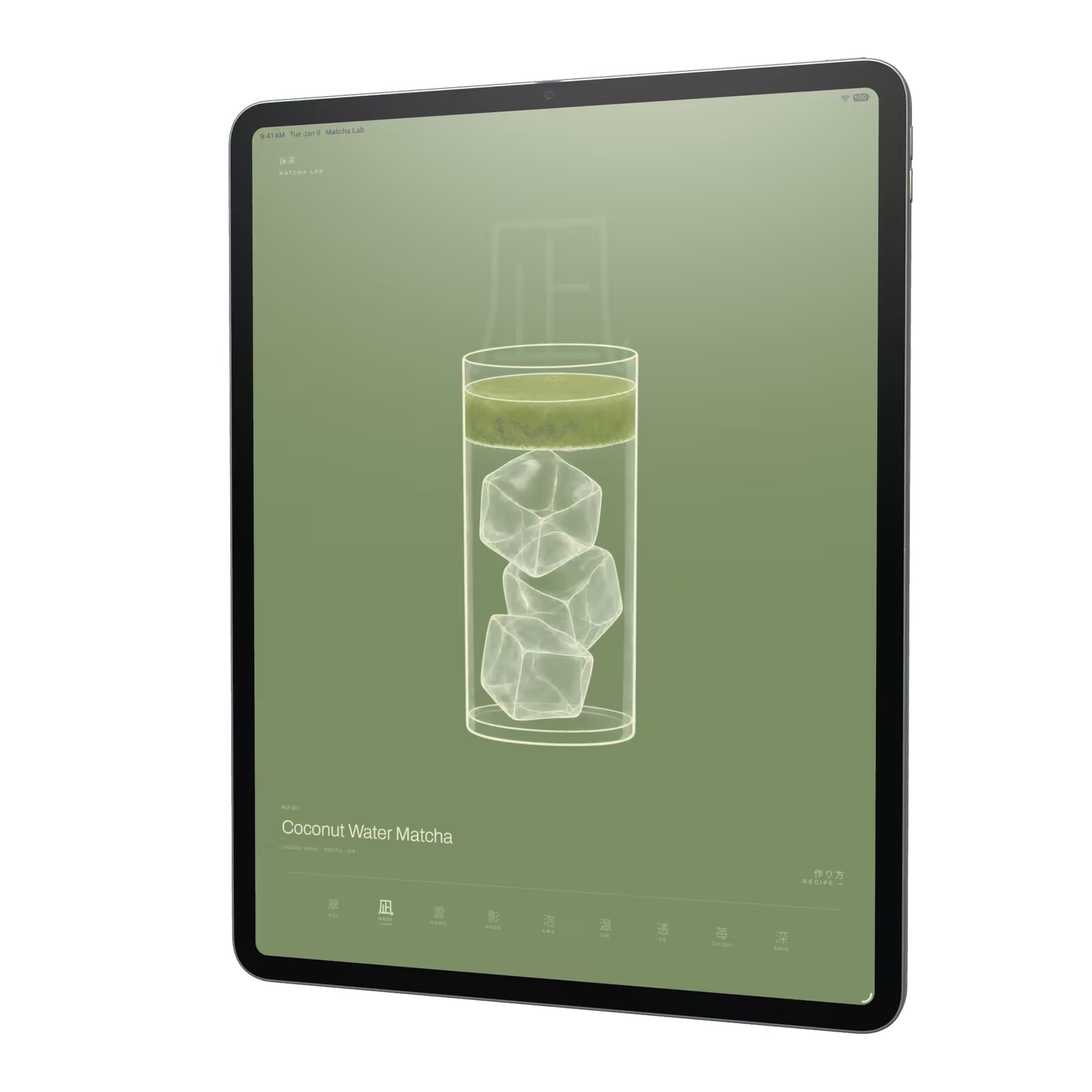
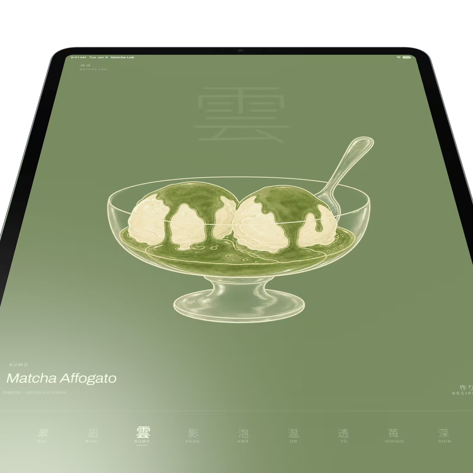
The visual direction came out of that same reaction loop. Japanese rather than cute. Matcha green as the environment rather than as an accent. Low information density, generous whitespace, few icons. Every drink gets its own identity, so the interface leads with 凪 NAGI and lets "Coconut Water Matcha" sit underneath in small type.
The change that reorganized everything was naming the device. A 12.9-inch iPad. That one sentence killed the responsive feed of recipe cards and turned the whole thing into a single-screen tasting menu on roughly a 4:3 canvas. One drink at a time. A kanji index along one edge. A recipe state that takes over the screen instead of scrolling past it. A hardware constraint became the interaction model.
Mockups, and a limitation that improved them
I took the brief into Claude Design expecting screens back. Instead it asked questions first, in a form I could answer by tapping: how should the drink imagery be handled, static screens or a clickable prototype, which states to mock, which drink opens by default. A second round got tactical about slot shape, canvas layout and the Japanese typeface. Two rounds of taps, almost no typing, and a vague thought was a specified brief.
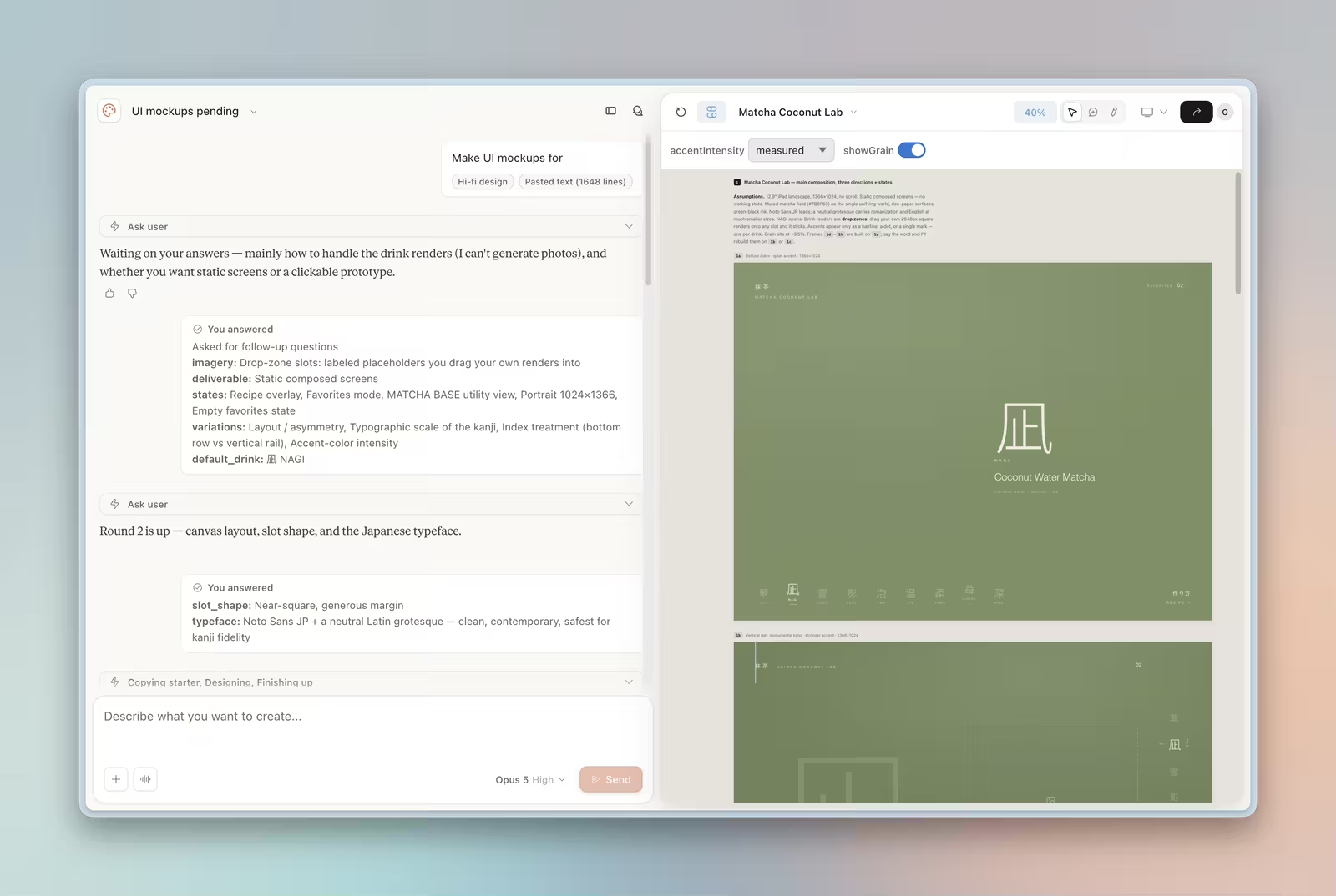
Then an honest limitation. It cannot generate photographic images, and rather than fake them with stock photos it made the drink renders labeled drop zones you fill with your own 2048px files, which then stick. The thing it could not do became the handoff mechanism. I would rather have that than a mockup full of images that never survive contact with the real build.
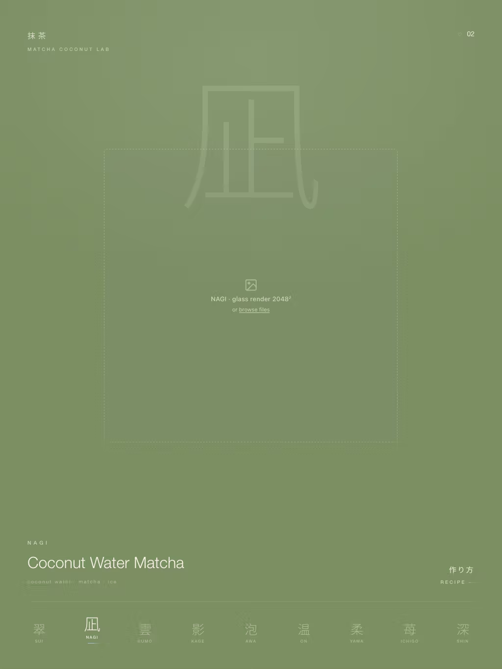
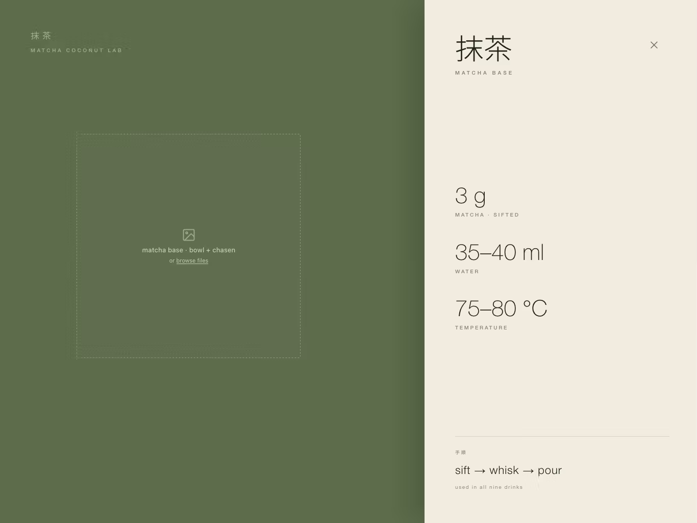
Three directions landed on one canvas: a bottom kanji index, a vertical rail with a monumental ghost kanji behind the drink, and a tasting-menu paper panel.
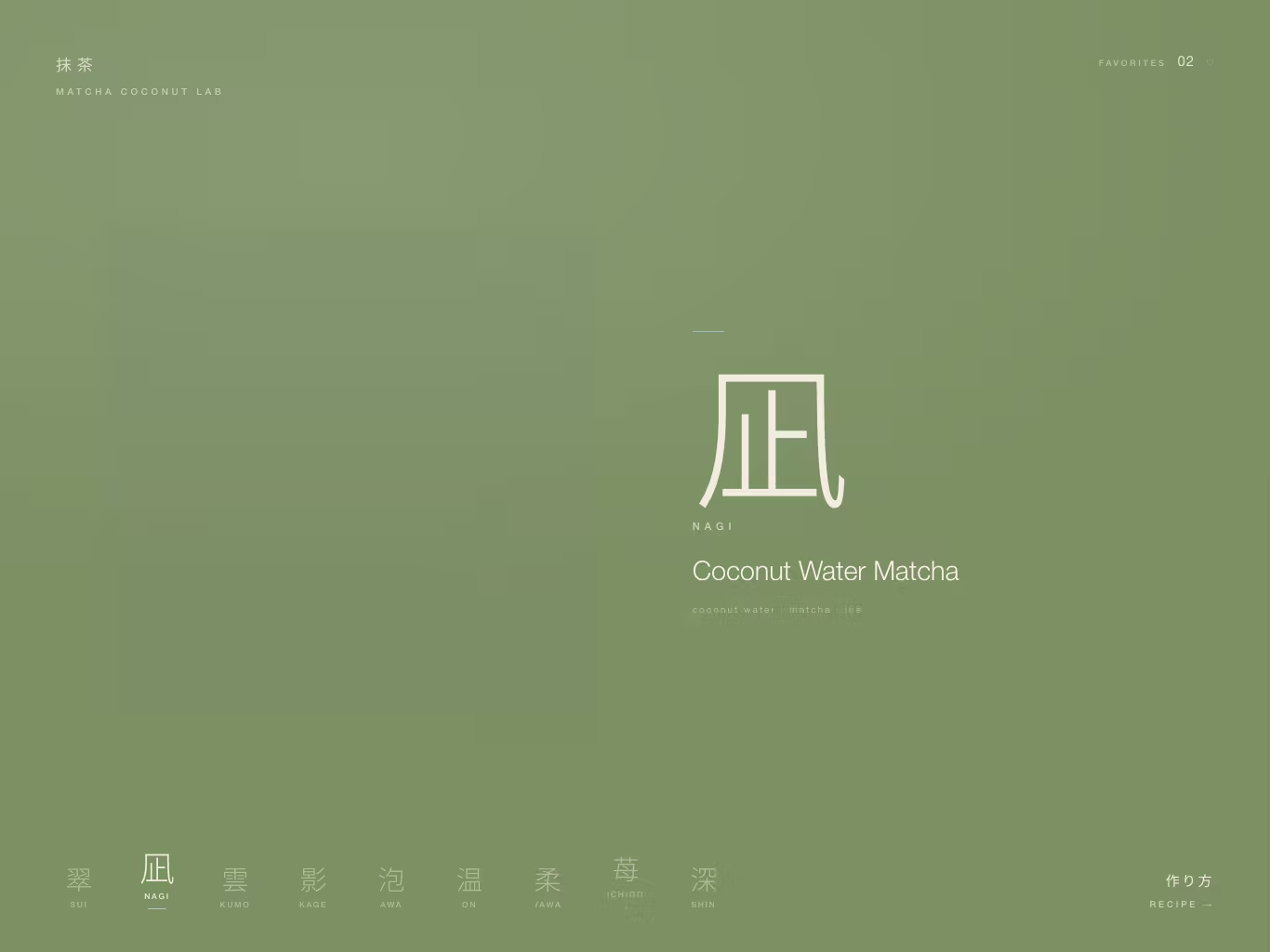
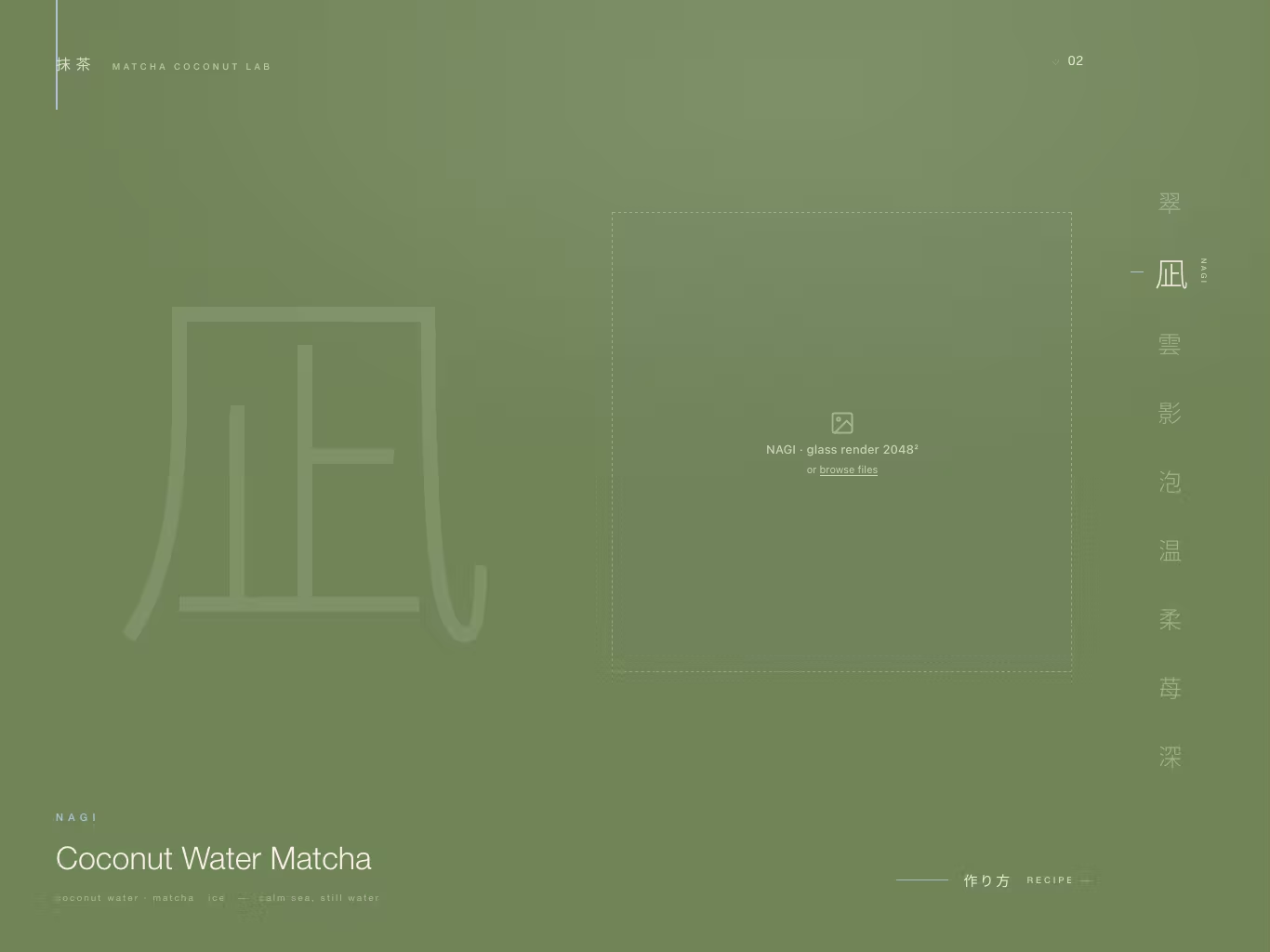
The real design work was three rounds of notes after that, each one a sentence rather than a redline.
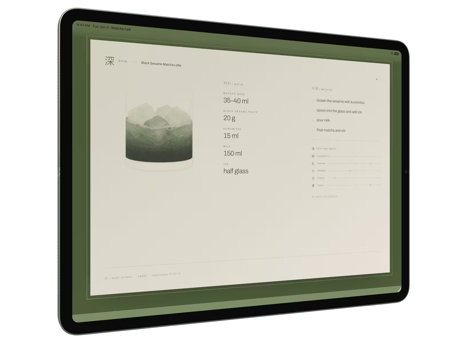
"The sidebar is a boring rectangle" lifted the paper panel off the green field inside a thin offset rule with corner ticks. "No corner radius, treat it as a floating paper sheet" was one sentence and one property. "Too boring to reflect its taste" turned a row of generic flavor bars into a printed tasting slip: five kanji-led axes, 椰 乳 力 涼 濃, on hairline scales with small diamond markers.
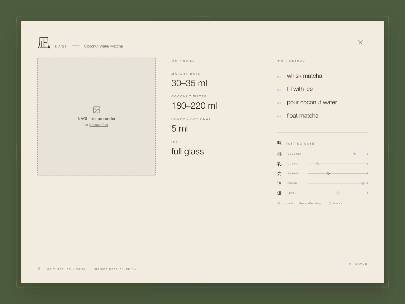
What I would point at is the vocabulary. "Make it nicer" produces nothing anyone can act on. "Treat it as a floating paper sheet" is a CSS property. Getting from the first to the second is most of the work, and having something concrete and slightly wrong on screen is what makes it possible.
Turning a mockup into numbers
A mockup is a picture of one viewport. Code has to hold at six. So before any component got written, every measurement came off the four reference screens at native size and got rewritten as a formula, in a document that says at the top: read this before positioning anything, do not re-derive.
Layout adapts by aspect ratio, not by width. Tailwind v4's --breakpoint-* namespace only generates width queries, and this design needs a compound one, so the shape system is three custom variants:
@custom-variant land  (@media (aspect-ratio >= 1) and (width >= 900px) and (height >= 620px));
@custom-variant port  (@media (aspect-ratio < 1)  and (width >= 700px) and (height >= 900px));
@custom-variant roomy (@media ((width >= 1280px) and (height >= 940px)) or ((width >= 960px) and (height >= 1280px)));
The width and height guards are the entire point. A 852×393 phone held sideways has aspect-ratio >= 1 and would happily take the tall landscape composition, so the height >= 620px guard sends it back to the compact treatment where it belongs. roomy is a density axis, not a third layout: it raises the type scale and the edge margin and changes nothing about the arrangement.
The number I like most is the portrait rail pitch, because proportion lost the argument. Scaling the master's 108px slot down gives about 88px, and nine of those come to 792px on a 768px-wide iPad, which overflows the screen. Nine slots of 80px come to 720px and clear it with 24px a side. So the pitch is 80px, set by the worst viewport rather than by the nicest one. The pitch is also fixed per slot, which means selection can change the glyph's size without moving a neighbor, the rail can never reflow under your finger, and the shared underline slides exactly the same distance every time.
Panel padding got the same treatment. The recipe sheet's padding is a straight line through two measured panels, 56px at the masters' 884px short axis and 30px at the tightest tablet's 652px:
--recipe-pad: clamp(16px, calc(11.2cqmin - 43px), 56px);cqmin, not cqw, because padding is spent on both axes and the axis with less to give should be the one that sets it. A wide, short panel must not spend its height on margin. And the panel declares container-type: size rather than inline-size, in a style prop so a utility class cannot override it. That one is a trap: inline-size resolves no block axis, so every cqh clamp would quietly collapse to its floor and the arrangement queries would never match. Nothing would look broken. It would just render the tall layout at minimum rhythm and I would spend an hour blaming the grid.
One hard rule sits above all of it. No nested scrolling at any target viewport. The tightest case is 1024×768, where the panel's content box is 772×516 against a worst-case column of five method steps, a rule, five axis rows and a summary line. It fits. If a content change ever breaks that, the fix is the layout or the content, never overflow: auto.
One color that is not green
There is one world color, one paper, one ink and one accent. #7B8F63 is the field, #F1ECDF is the paper, #1F271C is a green-black used only on paper, and #A8C4D6 is a pale blue that is the only thing in the app that is not green, off-white or black.
The accent marks selection and state, never decoration. If a blue line is not saying "this one" or "this is on", it should not be blue. That rule alone kept the interface from drifting into decoration every time something felt too plain.
Everything drawn on the field is paper at a fixed opacity ramp, and components reach for the role rather than the alpha: 100% for the drink title, 88% for the masthead kanji, 62% for micro-labels, 46% for the ingredient line, 22% for rules, and 14% for the enormous watermark kanji. The scrim behind the recipe overlay is a darkened field rather than a black wash, derived from the field's own shaded token:
--color-scrim: oklch(from var(--color-field-deep) 0.41 c h / 0.86);A neutral black scrim would kill the green, and the green is the entire world.
My favorite decision here is one that got rejected. The recipe overlay's hairline frame measures at paper 67%, and the nearest existing role is 62%. Over the scrim those two composite to within seven levels out of 255 on a one-pixel line. Adding a seventh field role for one element, four points away from an existing one, is exactly the drift a restraint rule exists to prevent, so it ships at 62% and the rejected token is written down with the arithmetic. Otherwise someone adds it next month and nobody remembers why it was a bad idea.
Fonts, because a missing glyph is instantly obvious
Both faces are self-hosted and subset, because a home-screen app has to launch from a cold cache with no network. Full Noto Sans JP is 9.6 MB. The subset here is 14 KB, and the two files together are 28 KB.
The Japanese subset is enumerated glyph by glyph rather than by unicode range, and kana are deliberately left out. Variable CJK carries heavy per-glyph data, so adding all hiragana and katakana takes the file from 14 KB to 96 KB for glyphs no string in the app ever sets. This is the complete list of Japanese the app can draw:
抹茶翠凪雲影泡温透苺深椰乳力涼濃味材料手順作方り度湯基本・ーAdd one glyph anywhere in src/ and the subset has to be rebuilt. A missing glyph falls back to the system CJK face and is obviously wrong on sight: different skeleton, different weight, different width.
font-display is block, not swap, which is the opposite of the usual advice and correct here. The files are small and preloaded, and a swap would flash the system face at 450px on a surface that is already painting flat #7B8F63. Forty milliseconds of nothing beats one frame of the wrong kanji at that size.
The transition
There is exactly one transition that matters, and it is the drink change. Six layers cross-dissolve, each lagging the one before it, and the giant watermark kanji goes last and slowest:
title → romaji → ingredient line → render → rail → watermarkThat order is the whole depth model. No 3D, no parallax, no scale. The thing nearest you moves first and the atmosphere moves last, and that is enough for the composition to read as having layers.
The brief said motion should be subtle enough that only someone paying close attention notices it. That is a taste judgment, and you cannot settle it by staring at numbers in an editor. Any single value looks defensible in isolation. So the calibration got its own dev-only route, /prototypes/motion, which renders four intensities of the same transition side by side and drives all four from one trigger.
export const CANDIDATES: readonly Candidate[] = [
  {
    key: "A",
    name: "Opacity only",
    claim:
      "Nothing moves in space. The quietest thing that still reads as a change.",
    // ...
  },
  {
    key: "B",
    name: "A whisper of travel",
    claim:
      "Four pixels of rise. Enough to feel a direction, not enough to see one.",
    chosen: true,
    // ...
  },
  {
    key: "C",
    name: "Legible depth",
    claim:
      "The stagger becomes noticeable if you watch for it. The watermark clearly trails.",
    // ...
  },
  {
    key: "D",
    name: "Too much, on purpose",
    claim: "The bracket. If this is preferred, the whole brief has moved.",
    // ...
  },
];
Two things about that instrument are worth more than the numbers it produced.
One trigger, four responses. Flipping between candidates one at a time measures your memory of the last one, not the motion in front of you. Relative intensity is only judgeable when all four answer the same change at the same moment.
And D exists to lose. You cannot judge "too subtle" without "too much" sitting beside it. A set of three quiet options just moves the question one step over and makes you pick a middle you have no reason to trust.
B won. Four pixels of rise, a 0.38s spring at zero bounce, 40ms of stagger per layer, and two pixels of blur at the far end of the dissolve. Four pixels is enough to feel a direction and not enough to see one. Two pixels of defocus reads as a layer settling into focus rather than as an effect anyone would name.
const MOTION: MotionTokens = {
  stagger: 0.04,
  layer: { visualDuration: 0.38, bounce: 0 },
  watermark: { visualDuration: 2, bounce: 0 },
  drift: 4,
  watermarkDrift: 8,
  carry: 48,
  blur: 2,
  watermarkBlur: 12,
};
Springs are declared as visualDuration and bounce rather than stiffness and damping, and that matters more than it sounds. "0.38 seconds to arrive, no overshoot" is a sentence I can hold an opinion about. "Stiffness 260, damping 30" is a sentence I can only run and squint at.
The retune that broke the instrument
After the calibration, the watermark alone got changed. Its spring went from 1 second to 2, its blur from 4px to 12px, against a pixel less travel. The layers still resolve at B's pace. What changed is how far behind them the atmosphere is allowed to lag, and at blur(12px) over two seconds it is comfortably the last thing on screen to settle.
Which broke the calibration set. B was now slower and blurrier than C, so the ladder ran A, C, B, D, and the one job the set has is to be a ladder. Fixing it meant rescaling C and D's watermark spring and blur back above the new B, with tighter multipliers than the originals: 12px is a much higher floor than 4px was, and holding the old ratios would have pushed D past 50px of blur, which stops bracketing the range and just erases the glyph.
That is a genuinely silly amount of care for a page that never ships to a user. I would do it again. An instrument that no longer measures what ships is worse than no instrument, because it still looks authoritative. The last commit in the repository is the one that reconciles the documented motion table with the shipped object, which tells you something about where the weekend went.
The swipe that refuses to snap back
The commit threshold is 64px of travel, with velocity worth 0.12 of a second of it, summed rather than checked separately:
export function swipeStep(offset: number, velocity: number): -1 | 0 | 1 {
  const travel = offset + velocity * VELOCITY_WEIGHT;
  if (travel <= -COMMIT_DISTANCE) return 1;
  if (travel >= COMMIT_DISTANCE) return -1;
  return 0;
}
A short fast flick commits. A long slow drag commits. A long drag released dead does not, which is the case that separates a gesture that feels alive from one that feels like it is guessing.
While the finger is down, the render leans a fifth of the finger's travel. At either end of the collection it leans a twentieth, so a swipe that cannot do anything still reads as an edge rather than as dropped input.
On release there are two outcomes and they must not look alike. Under the threshold, the lean springs back to center, and that bounce is the answer: nothing changed. Over it, the lean does not return on its own. The render carries 48px further the way it was sent while its replacement arrives from the other side, and the frame's return is retimed to the render's own place in the stagger so the two move as one piece. Let Motion handle the snap-back there and the drink appears to slide back out from under its own change, which is the kind of thing you feel before you can explain.
The gesture follows the rail, so it runs horizontally in portrait and vertically in landscape, where the rail is a column and the whole layout reads top to bottom.
The parts that never needed a prototype
Some motion rules were settled before the calibration and never moved.
Reduced motion keeps every state change and removes the travel. The transition collapses to a single 120ms cross-fade with no stagger, no movement and no defocus. Reduced motion must never mean no feedback. Both token objects are module-private and every exported helper takes tokens as a required argument, so a component cannot import the full set and quietly ignore the setting. It is also a hook rather than a constant, because iPadOS flips that switch from Control Centre and a home-screen app never gets reloaded.
styles.css deliberately carries no --motion-* properties. It carried eight of them and nothing ever read one. Springs cannot be expressed in CSS, so every animation here is driven from that object, and a parallel set of CSS numbers is a second source of truth with no consumer. It can only drift.
Only opacity, transform and filter animate. The single exception is the rail underline, which is one shared element moved with Motion's layout prop rather than nine elements fading in and out. And nothing animates on mount except the field itself. First paint is a still frame.
Nine images that have to be siblings
The drink art is the other place that silently drifts, so the prompt is written down verbatim with exactly one variable slot in it. Ground color, line weight as a percentage of frame width, camera height above the rim, subject at 70% of frame height, no shadow, no reflection, no surface. The document also records what a verified reference actually measured, down to the distinct color count, because that is what catches a near-miss.
The test it has to pass is specific: a fresh agent, a month from now, with no memory of the session, produces image ten and it belongs with the other nine. Change anything in the contract and you have invalidated all of them.
Shipping it to a home screen
The build is a plain static site. No server functions, no route loaders, no API routes. The deployable artifact is one directory, and everything after first paint is the browser.
The home-screen details are small and all of them matter. viewport-fit=cover puts the app under the camera housing, and the shell pays that back with env(safe-area-inset-*) so nothing inside a component ever has to know. The status bar style is black-translucent so the field runs under it rather than stopping at a gray strip. user-scalable=no, because a pinch zoom on a fixed single-viewport composition can only break it. The shell is height: 100svh rather than dvh, since the smallest viewport height is the one that keeps the composition intact mid-gesture while browser toolbars animate. body carries overscroll-behavior: none so a rubber-band drag cannot reveal anything behind the app.
Almost none of that is verifiable on a laptop. iOS only offers Add to Home Screen over https, so every home-screen behavior stays theoretical until the thing is on a real origin and on an actual iPad.
What did not survive
Favorites were in the mockups, got built, and then came out. Saving a drink implies a list to manage, and the app is nine peers you page through in ten seconds. "MATCHA COCONUT LAB" lost a word, because half the drinks have no coconut in them. The drag-and-drop render slots became a loading placeholder, since the nine images now ship with the app and there is nothing to upload.
Repository init to a calibrated transition took two hours and forty-four minutes on a Sunday evening: the design contract, the nine drinks, the shell, the landscape layout, the nine renders, the calibration prototype and the pick. The portrait layout and the recipe overlay landed before midnight. The swipe, the refinements and the documentation took most of Monday.
That ratio is not the one I expected going in, and it is the part I would defend hardest. The layout you can measure off a mockup. Four pixels you have to build an instrument for, and then keep the instrument honest after you change your mind about the watermark.