Payload Toolkit is a command line tool that installs blocks and features into a Payload project from shadcn registries. It has a web app on top, where you pick blocks from a catalog and press Install. And behind a Factory switch there is a 3D factory that does the same job slowly. A robot arm picks your blocks out of a cabinet, a conveyor carries them around the floor, and each part gets seated on a circuit board that stands for your app. At the end you get the same command you would have typed.
Thirty seconds of the toolkit. Pick blocks in the grid, switch to Factory, watch the line seat them on the board, and copy the command at the end.
It is still alpha, and the factory is still an experiment. These are notes on how the idea moved, in the order it moved. What I asked for, what came back, what was wrong with it, and what I asked for next. Most of the interesting decisions were about what to throw away.
Codex and Claude Code did most of the building. By the end I was usually talking to one coordinator agent that handed work to five or more others at once.
It started as a reply to an issue
Before the toolkit there was a starter template, payload-better-auth-starter. Payload, Next.js, Better Auth, a blog, forms and a few custom blocks, all in one repository. People used it, so people also hit its problems. About a fifth of its commits are dependency bumps, and at least two of those updates broke things for the people using it.
Then someone opened an issue proposing a pricing block from Payload Components, a block registry with its own installer. My reply on August 1 is the first time I wrote the idea down.
Instead of maintaining a single opinionated template, we could offer a minimal core with optional features such as authentication, Drizzle or MongoDB, form blocks with tanstack-form, custom UI components, and Payload Components blocks like this one.
I did not build it then. A week later I used Codex to rebuild the starter's layout and motion components as small composable pieces, with a plan to ship them as a package. Near the end of that session I added one requirement that outlived the package.
Please also mention each component comes with a .md file mostly for agents to understand and use
The package never shipped. The Markdown file did, in another form. Every bundled feature in the toolkit carries a versioned GUIDE.md that a coding agent reads to wire the feature into your project.
In September I asked Codex to port those same components into another Payload site I work on. The migration plan it came back with touched 37 files. That plan is when the idea stopped being abstract. I was the installer. Every time I reused my own blocks, I did by hand what a CLI should do.
A shadcn for Payload
The shape I wanted was shadcn's. shadcn does not give you a dependency. It copies source into your project, and from then on the code is yours. I wanted that for Payload, plus two things. New projects should start from Payload's own official template, and blocks should come from any shadcn-format registry, not only mine.
payload-toolkit init acme --framework next --database postgres --package-manager pnpm
payload-toolkit add forms --cwd ./existing-app --claude
payload-toolkit add @payload-components/hero-split
A few rules stayed from the start. The toolkit never owns your code after install, never overwrites a file you edited, and never commits in your project. When a feature needs wiring into your real config, it does not guess at your repository's shape. It hands the source and its guide to the coding agent you already use, or prints a prompt you can paste.
I asked for two architectures, not one. Two agents each sketched a design against the same brief and rubric, and a third judged both. The design with two verbs, init and add, beat the one with a separate planner, 25 to 22 out of 30, because the planner layer had no second caller. I kept the winner and borrowed two rules from the loser.
The part I am happiest with is the verification matrix. Every claim the CLI makes about a framework, database, operating system or package manager gets its own CI job. Next.js and TanStack Start each run against Postgres and MongoDB, with extra installer runs on macOS, Windows, npm and Bun. Every cell installs the packed CLI into a throwaway project, opens the admin, submits a form and checks that the submission reached the database. A cell that cannot run is reported as blocked, and blocked never counts as a pass.
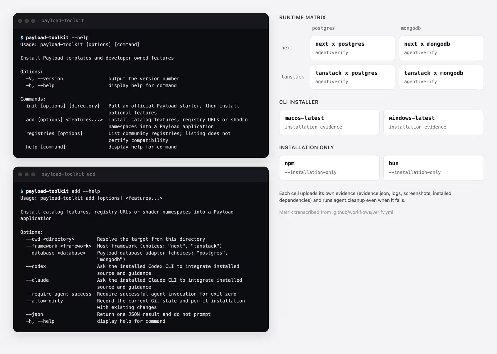
It paid for itself on the first afternoon. Windows CI failed, and five fixes landed in under half an hour for bugs that would never have shown up on my Mac. All 79 Payload Components blocks were also installed one at a time into fresh projects, and 78 passed a real browser check. The one that failed is broken upstream, so it is documented, not patched.
Why not a GUI
A CLI with this many flags is a form you fill in from memory. Framework, database, package manager, features, blocks from several registries, which agent. Once the CLI worked, the obvious question was why I was asking people to type a form.
So the next step was a web app whose only job is to build that command. I used HeroUI, because HeroUI v3 is built on React Aria, so focus handling, keyboard support and screen reader labels come with the components. The first version came together in an afternoon. A landing page, and a workspace with a searchable grid of 84 registry items and a Your setup panel that turns your picks into a payload-toolkit init command or an agent prompt.
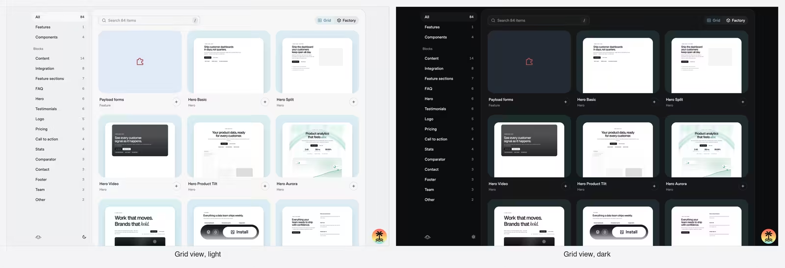
Every block got a real preview, rendered headlessly in each theme its registry ships. A grid of blocks without previews is a list of names, and nobody picks a hero section by its name.
A hero figure drawn in hairlines
The landing page needed one image that said what the tool does without a screenshot. I have a personal skill for Hairline figures, small isometric line drawings with a little animation, built in code. I asked for several, and each figure went to its own subagent.
Six came back. A robot arm placing a block into a socket. A pick-and-place arm seating a chip on a circuit board. A claw machine where registries are the prize pit. A tool tray with a wrench lifting out of foam. A cryptex. A block tower. I cut the cryptex and the block tower, because neither one said "install a block into your app" at a glance the way the arm and the socket did. I kept four, and put the robot arm on the landing page after one more pass, so the block seats into the socket instead of hovering near it.
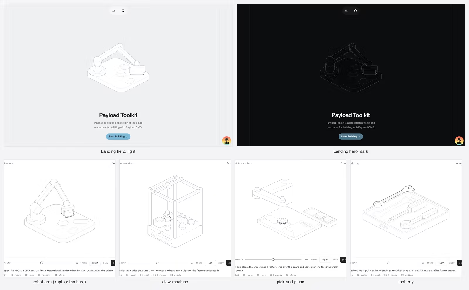
I did not know it yet, but two of those drawings were the start of the factory. The claw machine and the arm placing parts on a board both come back later in 3D.
Six minutes on a gradient
The next day went to motion. The floating bar at the bottom of the workspace morphs into the install card, and a registry card grows into its detail view. Each had to read as one object changing shape, and getting there was a long list of small corrections. The detail view's corner snapped at the start of every open. The morph assumed a 16 pixel radius, but the theme scales radii, so now it measures the real radius and animates between the two numbers. The frost on the bar and the page dimmer behind it were retuned twice between 10:17 and 10:23 at night, because each change looked right alone and wrong next to the other.
None of this shows in a screenshot. Every one of these fixes started the same way. I watched an animation, said in one sentence what felt wrong, and the agent found the number behind it.
Everything looked the same
By Friday night the web app was good. It was fast, accessible and tidy, and it looked like every other tool I use.
That bothered me more than I expected. Almost every product I touch is built to get me through a task faster. Fewer clicks, less waiting. The workspace was the same. It exists so that installing blocks takes less time than typing a command. That is a fine goal, but I started to wonder why setting up a project could not be slow on purpose. Something you spend time with and watch move, as if you were playing a game, but wired to the same CLI, so at the end you have done exactly the same task. Just slower, and with some joy in it.
That question is where the rest of the project went.
Eight metaphors overnight
I did not know what "slow and enjoyable" looked like, so the first move was to not decide. The lab started as eight different metaphors for the same flow, built side by side. Each rendered the same registry and ended with the same copyable command.
An exploded layer stack. A claw machine that prints the command on a prize ticket. An assembly line with a parts cabinet, a belt, an arm and a board. Record crates, a retro console with cartridges, a constellation of features, a tilted tower of page sections and a mechanical keyboard.
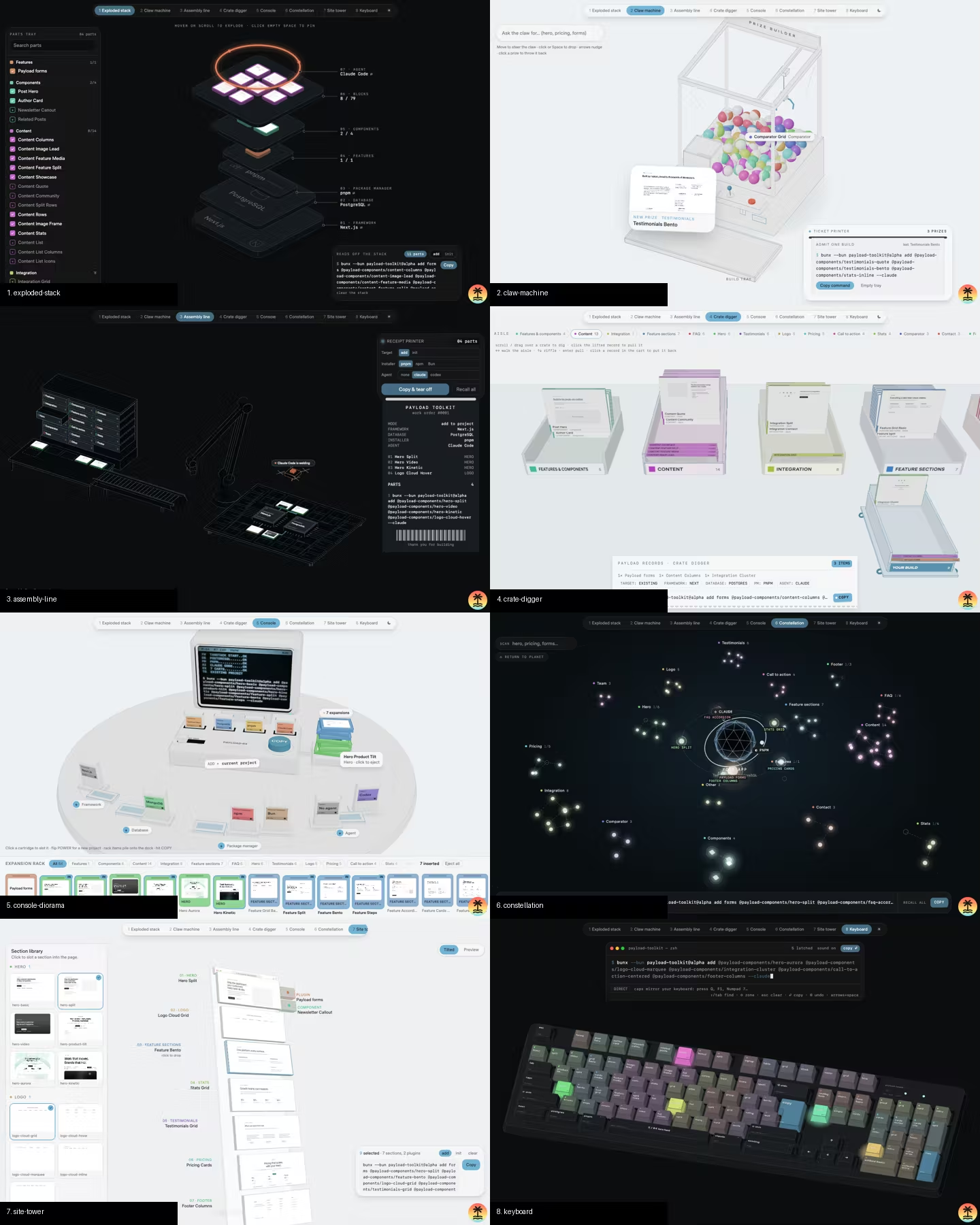
The assembly line won because it was the only concept where each station matched a real step of an install. Pick the block, carry it, seat it in the app. It was also the easiest of the eight to make accessible, and the easiest for other people to extend later with mods, because a new idea plugs into one station instead of rewriting the whole scene. You can see the win in the code. The next concepts copy its slot layout line for line.
That round ran overnight with two coordinating agents, and it is where I first saw parallel agents break. One agent rewrote a shared requests file in full and erased a request the other had left there. A better instruction would not have stopped it. Giving each agent files that only it could write did, and every parallel run after that used the same rule.
By morning there were 23 concepts. They all went into an archive folder, and one idea survived as the fab line.
A factory with slots
The fab line turned the best ideas from the variants into stations. A parts cabinet, a pick table, a transport, an arm, the app board, a chip close-up, plus a theme and effects. The key decision was to make every station a slot. A slot is a list of interchangeable variants, picked by a URL parameter, and the layout reflows from each variant's footprint. Want a pneumatic tube instead of a conveyor? Change one parameter.
Slots also made parallel work safe. Phase one built the core and the entry point, then froze them. Phase two gave each agent exactly one station folder. An agent that needed a change outside its folder could not make it. It had to write a request in an append-only file, describe its workaround, and wait for the folder's owner to answer. That file reads like a small team's issue tracker.
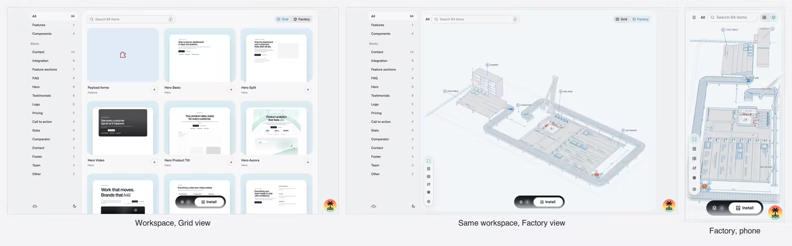
The workspace got a Grid and Factory switch that embeds the same scene. That switch is what makes the factory more than a demo. It reads the same setup as the grid and builds the same command.
Feel arrives as small complaints
The session I have a full record of started on Saturday morning with a numbered list of nine things. A few were bugs. Most were about feel.
The conveyor belt can wrap around the campus, so the animation is longer and more enjoyable.
That sentence is the project in one line. In the workspace, shorter is better. Here I was asking for longer. The agent added a hook so a transport can route itself around the other stations, and the ride went to about 13 seconds.
The camera panning and gesture feels off, the x-axis constraint paired with only up/down angle doesn't feel quite right. Can you redo it? Perhaps make it simpler?
The camera became map-style. Drag pans the floor, two fingers orbit, and scroll zooms toward the cursor. The next day I noticed the cabinet stop looked no closer than the pick table stop. Every camera stop had a minimum width of 13 units, and the cabinet is about 7 wide, so each stop now gets its own minimum.
Then the sound. "For the conveyor belt sound, it sounds bad, make it lighter or different kind of sound." The old hum was a low sawtooth drone. The new one is filtered noise that ticks like rollers. The agent said it could not listen to it, measured the new sound at about half the loudness of the old one, and left the judgment to me.
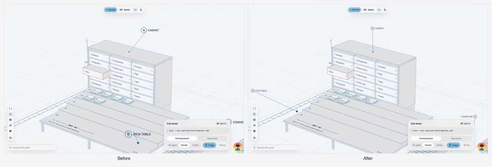
A strip of station thumbnails became a row of icons after I said I did not understand what it was for. Later, when a second bar ended up stacked on it, I asked for one vertical column, "so there are no stacked toolbars". The labels got the same treatment that night. I asked for them smaller and without the "SEE FIG." descriptions, and the agent also fixed a conveyor label that was cut off at the edge of the screen.
Show me before you build it
The settings went through several versions, and the turning point was the time I stopped the agent from building.
First it was two side panels, then one, saved in the browser. A review agent found five real bugs in that merge before I saw it.
Then I wanted something else and was not sure what.
I was thinking to show the setting as a sheet or drawer instead, snaps about 1/3 of the view with items scrolled horizontally. [...] Instead of changing right away, maybe let's visualize via the widget tool? Unless you are clear with what to change?
The agent drew a clickable mockup in the chat with two layouts and asked six questions. I answered, and it drew a second one. My reply started with "Chips + one strip." and asked for a horizontal scroll picker where the centered item is active, like the camera mode selector on an iPhone.
While it built, the agent decided against HeroUI Pro's sheet component, because it mounts as a modal that hides the live scene from assistive technology, and built a small sheet with Motion instead. I agreed, and I would not have caught that myself.
When the sheet covered the bottom third of the scene, I asked for the scene to shift up, with a second question attached. "What's the blast radius if we're going to make this change?" The answer came before any code. About 20 lines in two files, and a list of what else moves, including picking and zoom to cursor.
Too short and too direct
The conveyor had become the slow, satisfying ride I wanted. The other four transports had not.
They are currently too short and too direct. Unlike the Conveyor belt. Be wacky and bold, they can have different height, variable speed, dynamic effects that shake or affect the entire scene.
Before handing this to four agents, the coordinator did something I would not have thought to ask for. It first added the two shared pieces every transport would need, one hook for variable speed and one for scene shake, so four agents would not all edit the same core files. Then each transport went to its own agent, in its own file.
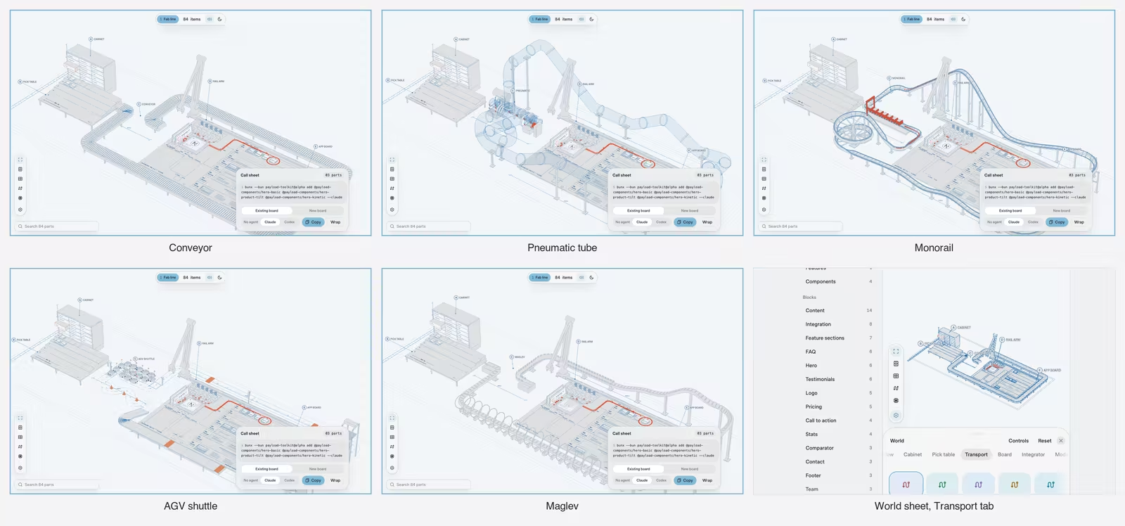
They came back as rides. A monorail roller coaster runs about 18 seconds, a glass tube slams into its stop, a maglev launches with a sonic boom, and a fleet of little shuttles runs errands for 25 seconds.
They also came back with a shared mistake. The speed hook only gave each transport a distance and a total length, so every agent rebuilt its own route by matching lengths. One matched wrong by a rounding difference, and maglev rides took 58 seconds while parts floated off their sleds. The fix went to one agent instead of four. The route now carries its own pacing, so nobody rebuilds it.
Slower swaps, and handing the choice to other people
When you change your framework or database in the factory, the matching chip on the board gets swapped. It used to just drop in. I asked for something slower, two to three seconds, with "more realistic or wacky effects".
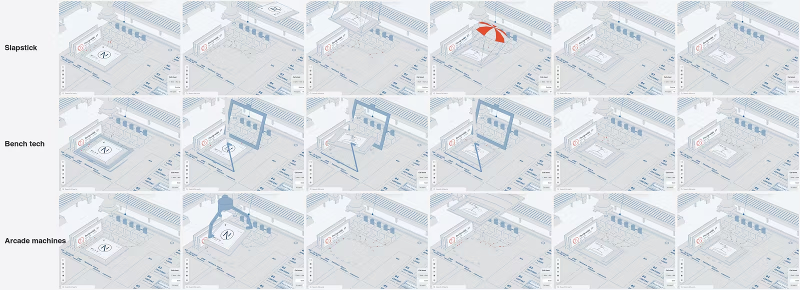
Three agents each built an answer. Slapstick throws the old chip out and parachutes the new one in under a striped umbrella. Bench tech has a technician lift a retention lever and place the chip with a vacuum pen. Arcade uses a claw crane. The lead agent recommended slapstick. The coordinator watched the frames, pointed out a 0.9 second gap where the socket sat empty, and suggested a mix. The careful bench routine for the CPU, slapstick for the rest.
I liked the mix, but I did not want my taste to be the only option.
I like your mix idea, go for it, although can you turn this into mods? So that people can contribute or develop their own way of swapping these sockets?
Mods had started the day before, from a question about whether someone could drop in a different look, which ended with "Be wacky." Instead of answering in theory, the agent built three working levels. Data mods are a JSON file of themes and routes that fits in a link. Code mods run their own code once you trust them. Layout mods swap the whole floor plan.
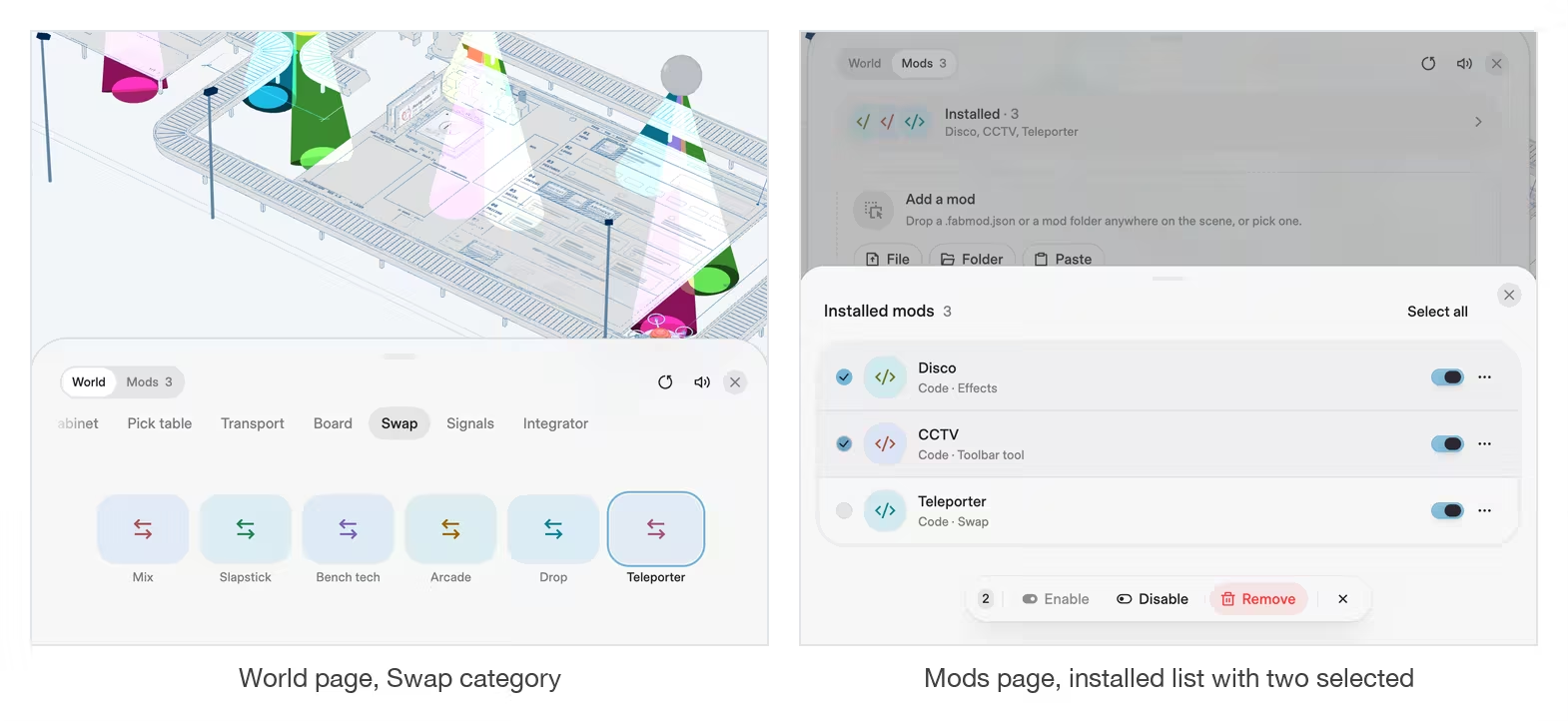
So the swap became one more slot. World settings got a Swap category with Mix as the default, and any style a mod adds appears after the built-ins. Mix is only a list that borrows the bench animation for the CPU and the slapstick ones for the rest, so a contributor can copy a built-in and change one socket. The sample mod is a Teleporter that beams the old part out and the new one in.
A settings sheet with two pages
The same message asked an agent to redesign the Mods tab, using app screenshots from Mobbin for reference. It came back with cards, a drop zone and a sample gallery, and most of my notes after using it were about what to take away. The warning paragraph in the review step "is too long, no one will read it," so it became one Run its code checkbox. Removing a mod lost its confirmation and gained an Undo. Installed mods moved into a nested list you can multi-select.
Then the header. Mute and reset needed a home, and Mods sat at the end of a scrolling row of categories. I asked for clickable mockups again. The agent drew four and recommended putting the actions in the header. I picked two pages instead, with a World and Mods switch at the top. Choosing Mods snaps the sheet taller, and the code that watched the sheet's position is gone.
Mods that bring their own buttons
Disco lit only about a third of the line, and I asked whether it should be scaled up or multiplied. The agent built both. One ball big enough to cover the line hung so high that the top of the screen cut it off. The agent kept a row of smaller balls instead, spaced from the layout, for four extra draw calls in total.
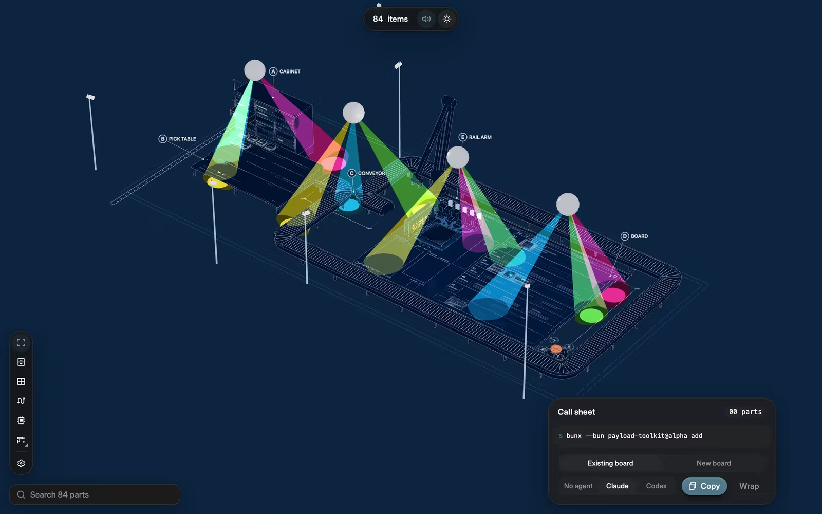
For a CCTV mod I first wanted a camera button in the left toolbar. Then I wanted more.
I wonder if we can add an option for such kind of mods that wants an additional slot on the sidebar [...] so that this can be truly extendable and mods can have multiple variants if the user chooses?
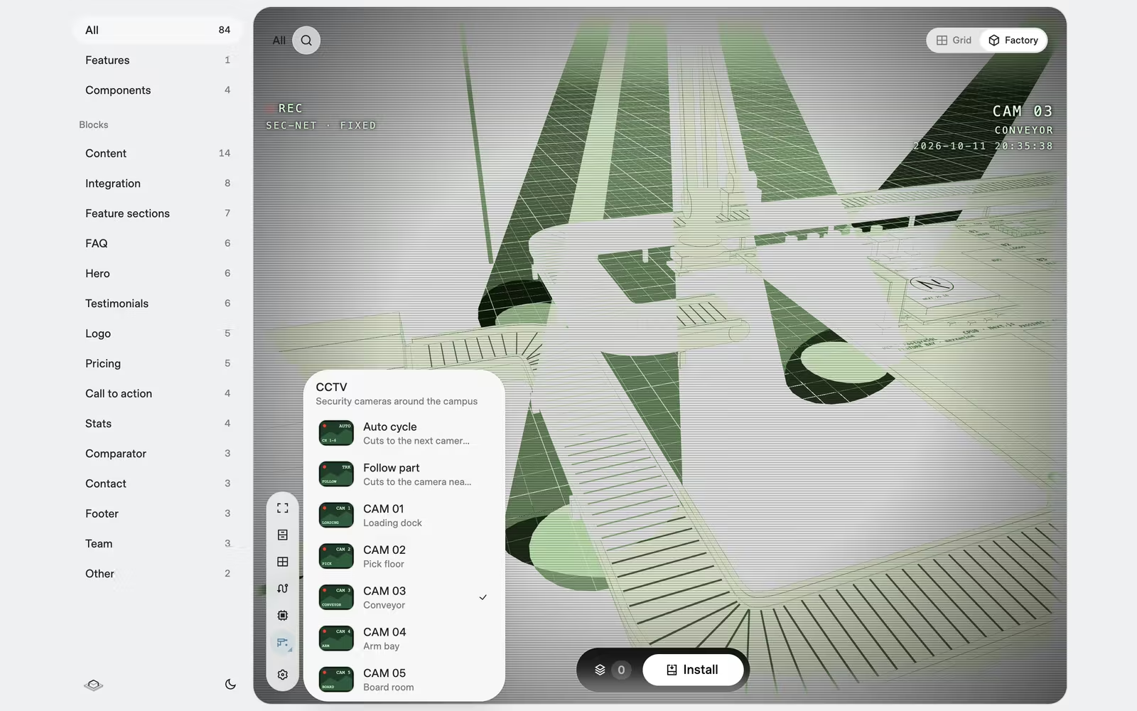
The agent kept the idea and changed one part. A mod lists its tools as data, a name, an icon and some variants, and the toolbar draws the buttons itself, so a broken mod cannot break the toolbar. I had offered a Hover Card or a Popover for the variants, and it argued for the Popover, because a Hover Card never opens on a touch screen.
After that the notes were about feel again. A flash of static on every cut went first. Then the motion.
For the CCTV camera angle rotating, is it possible to remove the easing of the camera so that it feels like a real machine motor move in a linear motion?
The cameras now pan at a constant speed, stop dead for a second at each end, and pan back.
When the bug was my computer
Late on Saturday, after I turned on the React Compiler, the dev server started reloading about seven times a second. The agent showed it happened with the compiler off too, so it was not the code. Something kept touching both package.json files. It guessed iCloud Drive syncing my Desktop folder, and said it had not verified that.
I turned off iCloud Drive syncing for this whole computer.
The reloads stopped, and the agent checked that the file timestamps held still before calling it fixed. It is the habit I came to rely on most. The agent kept what it had checked separate from what it guessed, and said which was which.
A real bug turned up on Sunday. A trackpad pinch zoomed the page and the 3D world at once, because the scene's scroll handler went through React and could not cancel the browser's zoom. The agent moved the listener onto the scene, and said it could not pinch a real trackpad, so the last check was mine.
Deleting most of it
On Sunday afternoon I looked at how big the thing had become.
We've added about 80,000 lines for this workspace 3D. I wonder how much of it can be simplified or deduped and merge special cases.
Four review agents read the code, one each for reuse, simplification, efficiency and altitude, meaning patches that should have been fixes in shared code. First the coordinator measured. About 56,600 of the lines were the archive of overnight concepts, and nothing live imported them.
Sure, delete the archive folder
The first cleanup wave had one rule. Everything had to look the same, and agents checked it with before and after screenshots. Real waste went, such as a parked fleet of shuttles that sent 18.6KB to the GPU every frame for nothing. But the live code stayed about the same size, and the agents planned the deeper redesigns under the same rule. I loosened it.
I'd loosen the restriction on must look the same. The goal is to build an efficient yet extensible world and the less outlier or special cases we have the better.
That turned a cleanup into a redesign. Thirteen slots now live in one table that World settings, the toolbar, mods, share links and loading all read. Anything that moves asks for frames through one keepAnimating() call. Chips draw in one batch, which took a busy board from 203 draw calls to 122. The camera became an ordered list of shots, and each station declares its own framing. Two old framing bugs got fixed on the way, a bottom margin that worked backwards and framing that ignored perspective. Neither fix was allowed under the first rule, because both change what you see.
Last, I asked whether React's Activity API could keep the factory alive when you switch to Grid. It now mounts on your first visit and only hides after that, so the camera and the line mid-run are still there when you come back.
The lab and workspace code ended at about 26,600 lines plus 2,000 of tests, down from about 84,000 a few days earlier. Most of what went was exploration I had made in order to throw away.
What I took from it
These are the things I would tell myself before starting again.
Something concrete and slightly wrong beats a good description. I could not have described the factory, but I could pick one out of eight. Six hairline figures became one. Twenty-three 3D concepts became one line. Whenever I was unsure, the cheapest move was two or three versions behind a switch, chosen by looking. The other half is deleting the rest. Two-thirds of the 84,000 lines were concepts I had already rejected, and shared hooks had to keep working for code nobody ran. Git keeps the losers anyway, so next time they go the day a winner is picked.
My notes were about feel. Turning feel into numbers was the agent's job. Lighter sound. Simpler camera. Longer ride. Slower swap. No stacked toolbars. Almost none of my messages named a file or a value. The agents came back with the numbers: half the loudness, 13 seconds, two to three seconds, a 13-unit camera stop that was wrong for a 7-unit cabinet.
Parallel agents break at shared state, and the fix is structure. The overnight run lost a request when one agent rewrote a shared file. The transports went wrong because four agents each rebuilt the same route from a hook that told them too little. What worked was ownership. One folder per agent, an append-only file for requests, and shared pieces added by the coordinator before fanning out.
Ask for a picture or a blast radius before the code. The two most useful things I asked in the whole project were questions, not instructions. One asked to see the settings sheet as a mockup first. The other asked what else would move if the scene shifted up. Both were cheap to answer, and both saved a round of building the wrong thing.
Slow for the person using it means precise for the person building it. A two-second chip swap has more ways to look wrong than an instant one. The workspace took an afternoon. The slow version took days, mostly on timing, sound and camera work that a fast tool never needs. Agents made that affordable, and I do not think I would have tried it alone.
Keep the record. The transcripts from the week I designed the CLI and built the first concepts are gone, so the reasons behind those early cuts in this post come from my memory, not from anything written down at the time. The weekend of factory work went in as one commit on Sunday night. Next time I would commit at the end of every round and keep a short decision log in the repository, so the reasons stay with the code.
The toolkit still installs blocks the fast way, and that is still the right default. The factory is for when you have a few minutes and want to watch your project get built. It ends with the same command either way.