UT students bounce out of MyUT and into Google when campus information feels scattered. Finding the academic calendar, a faculty office, or a tuition link should not require three browser tabs and a lucky search query. In UX Prototyping, Hao, Taek, and I treated that as a product problem rather than a homework brief. We talked to the people who own student apps at UT, shipped a working app, and put it on the App Store.
UT Companion is live at the App Store. The code is on GitHub. It is not an official UT app. The listing is published independently under Jiuzhen Pan / Uing Dev.
The deck
Here is the presentation we gave, including the research, the competitive read, and the testing tables.
What the product actually is
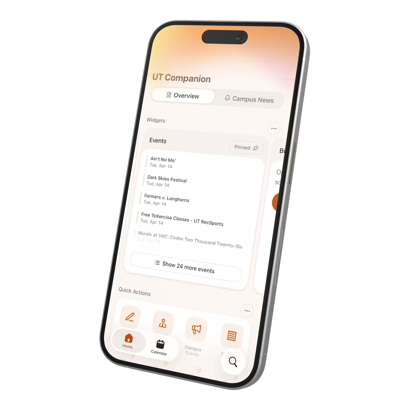
The honest frame matters. UT Companion is a campus launcher and companion, not a MyUT clone with private grades or course databases. Registration, grades, and tuition still open official UT systems. Our own surface is the home widget strip, a curated service directory, Discover and search, faculty and buildings and library tools, and one native iOS Parking widget.
That boundary kept the project shippable. We could redesign navigation and browse without pretending we owned the systems of record.
Team and the MyUT conversation
Oliver handled engineering. Hao led design and most of the department communication. Taek covered design, research, writing, testing, and keeping the work on track.
We worked with the Digital Product Manager of Student Apps in the Office of Scholarships and Financial Aid. Secondary data from that office, including search logs and an analysis report, shaped how we read MyUT's current state. We also surveyed 16 UT Austin graduate students about how they find campus resources. Later we presented to board and staff audiences, including the student-apps side of that office.
We did not invent a partnership story. We showed working software to the people who already ship MyUT, and we kept building after the course ended.
What students told us
The survey answers clustered into three complaints that feed each other.
Links are buried. Students could not reach a resource without descending several levels and clearing multiple authentication walls. The same link then shows up in two places under two different names, so students cannot tell whether they have already tried it. Put those together and every screen asks for a decision the student has no basis to make. Several people told us they installed MyUT, opened it, and uninstalled it because they were not sure what to do with it.
That is the frustrating part. UT is a public ivy, the top-ranked college in Texas, with an iSchool ranked in the world's top five. There is no shortage of resources here. They are just hard to find, so they go unused, and students miss opportunities that were sitting right there.
The pivot away from search-first
Our first design direction put an AI-powered search box at the top of the app. Ask for anything, get it.
The survey killed that idea:
- 43% said they are unlikely to use search when looking something up
- 50% prefer browsing over searching
- 57% are not confident in MyUT's search results
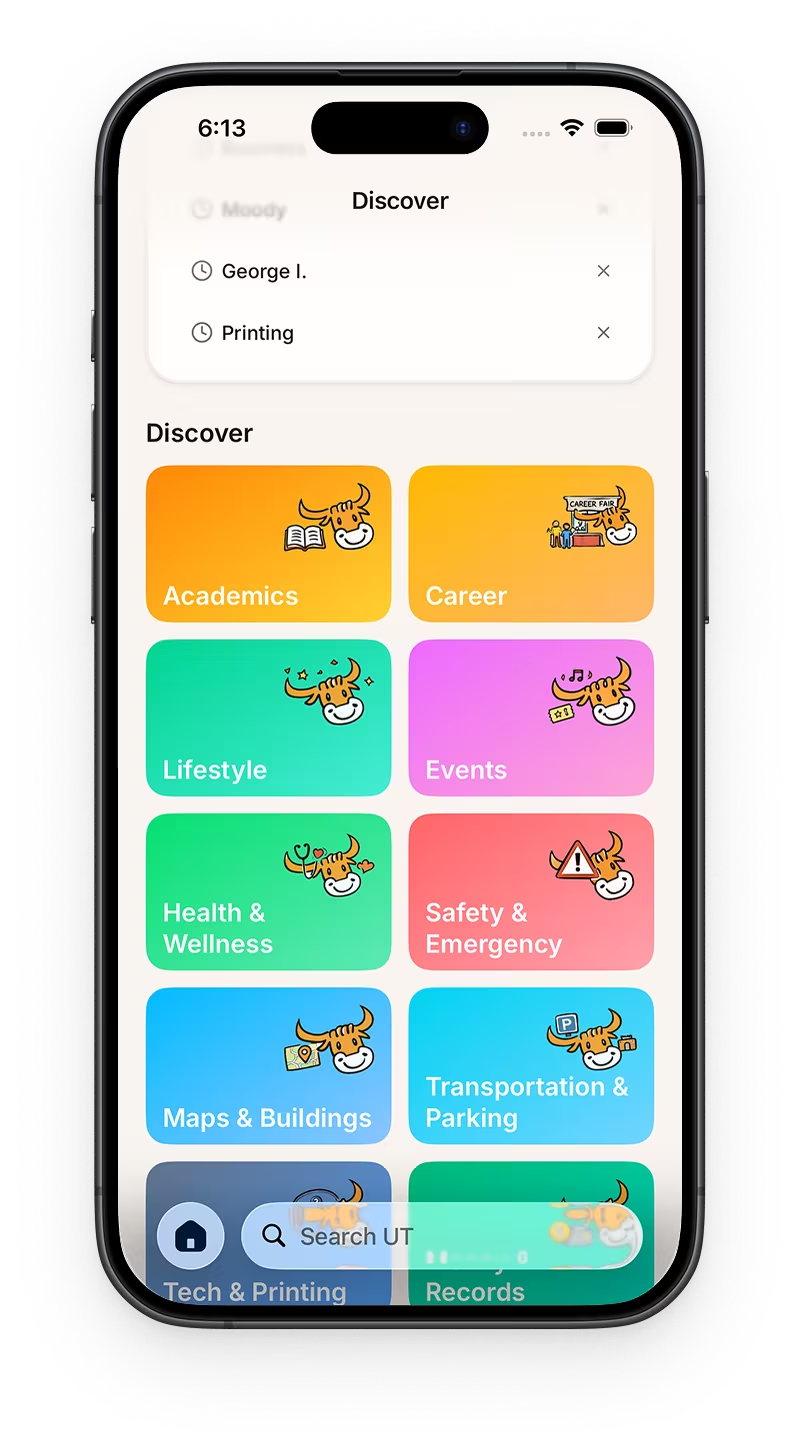
Most students are natural browsers. They would rather scan visual categories and thumbnails than type a specific written query into a box. Browsing and searching answer two different questions. You browse when you are not sure what you are looking for. You search when you know exactly what you want and just need the link.
The insight that reorganized the whole project is that these are not competing features. Search performs better when it sits on top of a strong navigation system. Well-organized content schemes, clear navigation structure, and honest labels are what make a search box useful in the first place. So we stopped trying to build a smarter search box and started fixing the content structure underneath it.
Reducing cognitive load in the layout
Rather than dumping everything on one screen, we split information by urgency and use case.
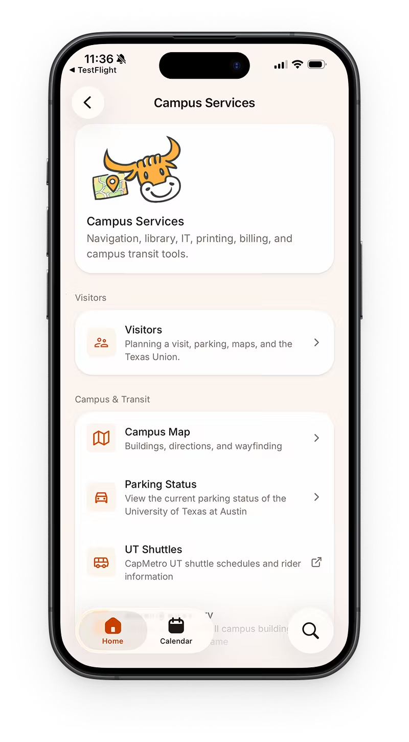
Widgets carry timely, changing information: parking availability, bus arrivals, dining, events, night travel. Quick Actions hold the frequent, high-priority tasks, chosen from usage data. The main menu stays comprehensive but is grouped into four contextual categories instead of a flat directory. The goal is an app that reads like a guided starting point instead of a long list.
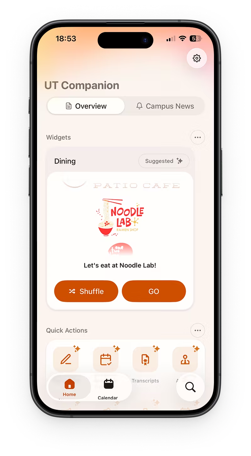
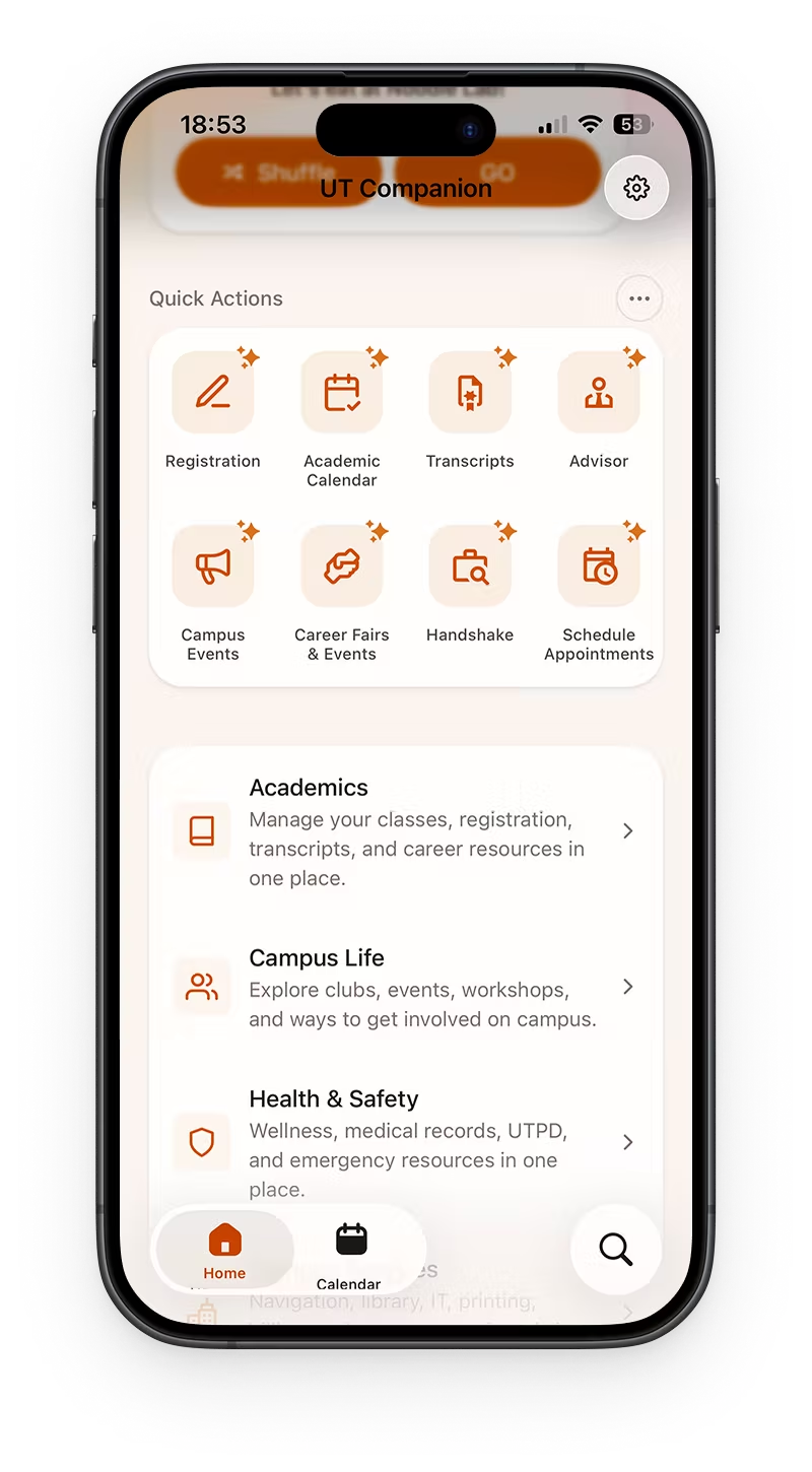
The widget strip is also time-aware. Registration, tax forms, flu shots, career fairs, and finals support do not deserve the same visibility in August and in April. Scoring by time of day and weekday moves the right thing to the front: mornings favor parking, late nights favor night travel, lunch favors dining. The resolver is plain TypeScript in widgets.home.ts, not a special runtime.
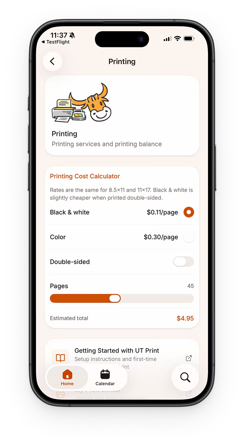
We also rewrote the labels. In the survey, several people said they could not tell what a service was for, and that some services looked interchangeable. Every entry now has one line of subtext and a distinct icon, so it can be understood without a click. Where a page can answer the question outright, it does, instead of shipping you to a PDF of rates.
Search
Search is still the backbone of everything else. Searching for information is what people do. It rescues you when there is too much to browse, it is expected to exist whether or not you use it, and it papers over the seams of a site assembled from many sources. Students only reach for it when browsing has failed them, which is exactly when it has to work.
Synonyms and abbreviations
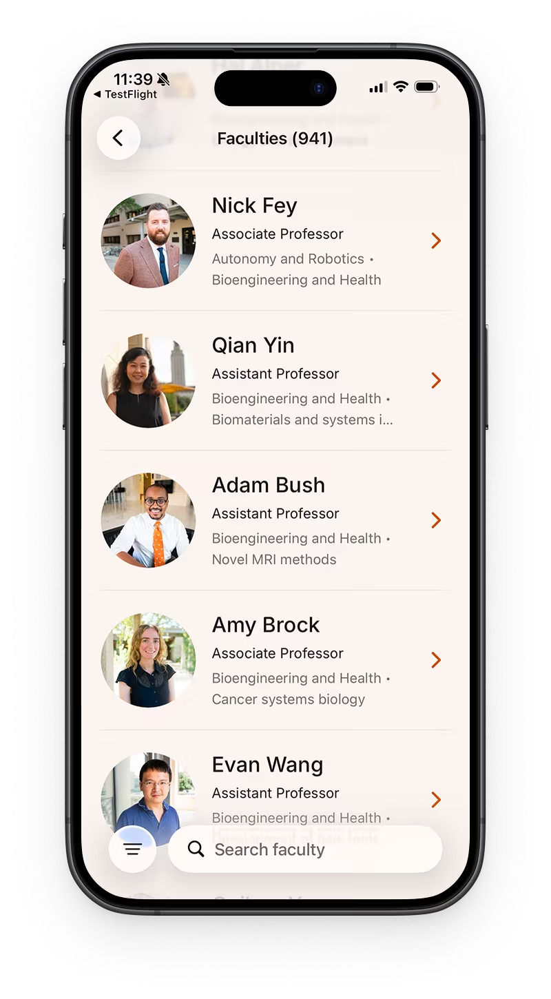
Students do not type official names. They type "PCL", not "Perry-Castañeda Library". Round two of testing made this obvious: search wanted exact keywords while students used abbreviations and shorthand.
So every node in the service directory can carry a controlled vocabulary of the terms real people use, each optionally paired with the official name:
/** Search alias paired with an optional canonical name (e.g. pcl → Perry-Castaneda Library). */
export type ControlledVocabularyEntry = {
  /** Abbreviation, acronym, or alias users may search. */
  term: string;
  /** Optional full phrase also indexed for matching. */
  professionalName?: string;
};
The library entry then declares both the loose phrases students actually type and the controlled terms:
campusServicesCatalog.item({
  id: 'library',
  title: 'Library',
  description: 'Hours, branch locations, study rooms, and library tools.',
  action: { type: 'screen', href: '/campus-services/library' },
  browseCategories: ['academics', 'lifestyle', 'visit'],
  aliases: ['pcl', 'study rooms', 'where is the library', 'reserves'],
  recommendation: { baseScore: 10, preset: 'semesterStart' },
  controlledVocabulary: [{ term: 'my print center' }, ...LIBRARY_CONTROLLED_VOCABULARY],
}),
LIBRARY_CONTROLLED_VOCABULARY is my favorite line in the codebase, because nobody wrote it. The branch table already had to exist to render the library screen, and every row already had an abbreviation and a full name, which is exactly the shape of a synonym pair:
export const LIBRARY_CONTROLLED_VOCABULARY = LIBRARY_BRANCHES.map((branch) => ({
  term: branch.abbreviation,
  professionalName: branch.name,
}));
One table generates the branch UI, the campus address, the map link, and the synonyms. PCL leads to Perry-Castañeda for free, and so does every other branch, forever, without anyone maintaining a second list.
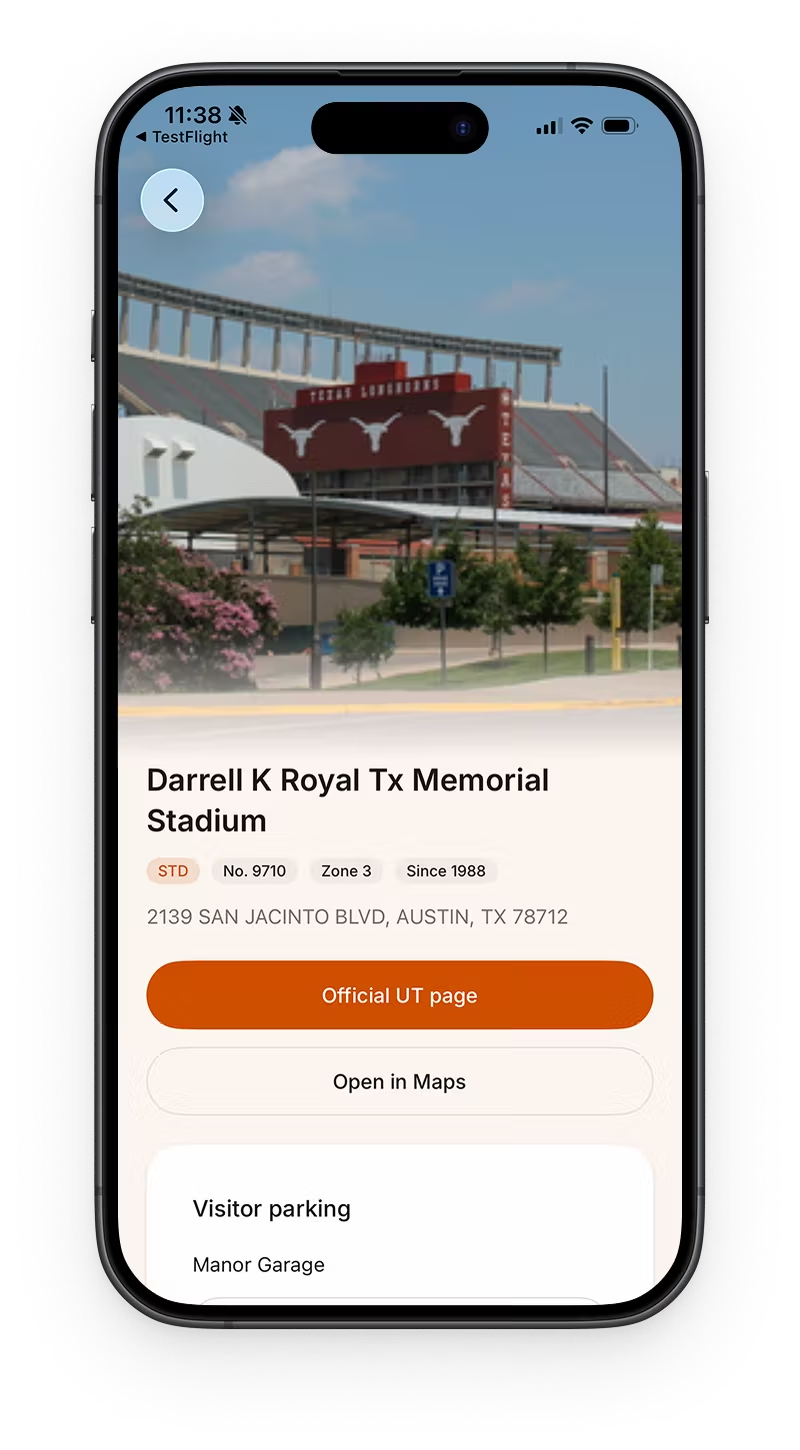
Buildings work the same way from the other direction. Event listings around campus are written in abbreviations that no first-year has learned yet, so the building index boosts the abbreviation hardest. Type WCP, AHG, or MMS and the building is the first result:
fieldsOf: (building) => [
  { value: building.abbr, boost: 150 },
  { value: building.name, boost: 110 },
  { value: building.officialMapAddress, boost: 40 },
  { value: building.closestVisitorParkingName, boost: 20 },
  { value: building.searchText, boost: 0 },
],
Spelling should not be a gate
Perry-Castañeda has an ñ in it. Nobody types the ñ. Both the index and the query get folded through the same normalizer, so accents stop mattering in either direction:
function normalizeText(input: string) {
  return input
    .toLowerCase()
    .replace(/&/g, " and ")
    .normalize("NFKD")
    .replace(/\p{M}+/gu, "")
    .replace(/[^\p{L}\p{N}]+/gu, " ")
    .trim()
    .replace(/\s+/g, " ");
}
NFKD splits an accented character into a base letter plus a combining mark, and the \p{M} strip drops the mark. Keeping the class as \p{L}\p{N} instead of a-z0-9 is what lets Chinese and Spanish text survive into the index at all, which matters later.
Ranking by how well it matched, not by where it matched
The scorer walks a ladder of match quality. An exact hit beats a full prefix, which beats every query word prefixing some word in the term, which beats a contiguous substring, which beats mere token coverage:
if (term === query.normalized) {
  return 260 - term.length;
}

if (term.startsWith(query.normalized)) {
  return 220 - term.length;
}

const words = term.split(" ");
const hasTokenPrefixes =
  query.tokens.length > 1 &&
  query.tokens.every((token) => words.some((word) => word.startsWith(token)));
if (hasTokenPrefixes) {
  return 180 - words.length;
}

const contiguousIndex = term.indexOf(query.normalized);
if (contiguousIndex !== -1) {
  return 150 - contiguousIndex;
}
Shorter terms win ties, since 260 - term.length rewards the tighter match.
The version I shipped first added the field weight straight onto that score. Titles are weighted 420 and descriptions 80, so a weak title match beat a strong description match every time, and results were sorted by which field matched instead of how well it matched. The fix was to scale match quality up and squash field weight down into a bounded tie-break:
const MATCH_QUALITY_SCALE = 100;
/** Field weight contributes at most this many points of tie-bias. */
const MAX_FIELD_BIAS = 40;
const ITEM_BIAS = 50;

const weightedScore =
  score * MATCH_QUALITY_SCALE + fieldWeightBias(field.weight) + itemBias;
Field weight and item-versus-page now only break ties between matches of equal quality. Aliases sit at 400, just under titles at 420, so a student's shorthand is treated as almost as authoritative as the official name.
Granular search into nested pages
Directories go three levels deep, and the thing a student wants is usually a leaf. Indexing only top-level pages would mean typing an exact query and landing one screen short of the answer.
So the indexer flattens every node into its own document, and carries ancestor titles and ancestor vocabulary down the tree as it goes:
for (const page of pages) {
  const pageControlledVocabulary: ControlledVocabularyEntry[] = [
    ...ancestorControlledVocabulary,
    ...(page.controlledVocabulary ?? []),
  ];

  documents.push(
    buildDocument(page, ancestorTitles, ancestorControlledVocabulary, locale),
  );

  for (const child of page.children) {
    if (child.kind === "page") {
      visitPages(
        [child],
        [...ancestorTitles, page.title],
        pageControlledVocabulary,
        documents,
        locale,
      );
      continue;
    }

    documents.push(
      buildDocument(
        child,
        [...ancestorTitles, page.title],
        pageControlledVocabulary,
        locale,
      ),
    );
  }
}
Inheritance is the whole point. "UHS" is declared once on the health page, so typing it reaches a nested Appointments item whose own text contains nothing resembling the query. There is a test pinning exactly that:
const index = buildServiceDirectorySearchIndex([parentPage]);
const matches = findServiceDirectoryMatches({ query: "uhs", index, limit: 6 });
expect(matches.map((m) => m.id)).toContain("test/parent/child");
Node ids double as routes, so a result is directly openable. campus-life/career-services/twelve-twenty-events becomes /d/campus-life/career-services/twelve-twenty-events through a catch-all route, and selecting a result either pushes a screen, opens an in-app embed, or hands off to the browser depending on the action the registry declared.
Autocomplete
Autocomplete exists to spare people from recalling what they typed. Recognizing a phrase is much cheaper than reconstructing it. Suggestions merge recent searches with a static seed list, ranked by the same scorer, with the current query filtered out so the box never offers you what you already typed.
The detail I like is the duplicate rule. "underground" and "Texas Union Underground" are one idea, and showing both wastes a row:
function areSemanticallyDuplicateSuggestions(left: string, right: string) {
  if (left === right) {
    return true;
  }

  const [shorter, longer] =
    left.length <= right.length ? [left, right] : [right, left];

  return longer.endsWith(` ${shorter}`);
}
Recent searches persist through expo-secure-store, capped at twelve, deduped case-insensitively. Every write swallows its own errors, so a storage failure degrades history rather than breaking search.
Ranking runs synchronously on every keystroke and stays responsive through useDeferredValue alone. No debounce, no memo. The index is about eighty documents, which is small enough that the concurrent renderer is the entire performance strategy.
Searching in three languages
The i18n pass in July raised a question with three bad answers and one good one. English-only search with translated display is absurd: a student who sees 圖書館 in the UI but has to type "library" to find it is worse off than before. Fully replacing the index with translations is also wrong, since UT's international students overwhelmingly know these services by their official English names.
So each document indexes both, with localized fields weighted ten points under their English counterparts:
addField(fieldMap, "title", item.title, 420);

if (localized) {
  addLocalizedField(
    fieldMap,
    "title",
    `registryData.${item.id}.title`,
    locale,
    410,
  );
  addLocalizedField(
    fieldMap,
    "description",
    `registryData.${item.id}.description`,
    locale,
    70,
  );
}
Aliases and controlled vocabulary stay English-only on purpose. "PCL", "UT Direct", and "registrar" are not words that translate.
What testing said
Three rounds, six participants, each doing the same tasks on MyUT first and then on our build so the comparison was direct. The redesign scored 86.7 on the SUS, an 89% improvement over MyUT on the performance metrics we tracked, with learnability down 40%. Those came from timed tasks, completion rates, and single-ease questions on a working build, not from a pitch deck.
The behavior we watched was more useful than the scores.
Users browse first and search last. Most participants only opened search after navigation failed them. That is what redirected the project from building a stronger search box to fixing the structure it sits on.
Users do not think in institutional categories. They look for familiar words and clues that match their goal. A study room could plausibly be Academic or Campus Life depending on who you ask. Short descriptions under each entry cut wrong clicks more than any relabeling did.
Too many similar options makes people hesitate. MyUT has real resources, but when the choices look dense and repetitive, students give up and go to Google. Grouping and thinning the options let people decide faster.
False start, then Companion
The git history is messier than a clean origin story, and that is the interesting part.
The repo started on 2026-02-25 as a GPT and hub experiment: Convex, Clerk, chat. Mid-March we stripped that stack and renamed the project to UT Companion in commit 8e673c1 on 2026-03-24. App Store cleanup landed two days later in 68b668a.
The pivot was the product decision. Campus navigation did not need a chat backend. It needed a trustworthy directory, a home that surfaces the right tools at the right hour, and a path to ship on phones students already carry.
Expo architecture
One React Native tree runs the app on iOS and web. Expo SDK 57, expo-router file routes under src/app/, domain modules in src/components/ and src/lib/. The tabs are home, calendar, and discover. Shared UI stays shared. Platform files cover the rest through *.web.tsx and *.ios.ts splits.
Web sets web.output: 'server' so +api routes can scrape and cache parking and campus feeds. Native either hits that app-server origin or falls back to the upstream source through a shared feed client. Calendar is native-only; on web the calendar tab is hidden. Preferences persist in MMKV on device and localStorage on web.
Home composition stays boring on purpose:
export default function OverviewScreen() {
  return (
    <>
      <MessageCarousel />
      <WidgetsSection />
      <QuickActionsSection />
      <ServiceDirectoryCard />
    </>
  );
}
The feed routing policy lives in one place. Web always calls the same-origin +api route. Native prefers the hosted origin when EXPO_PUBLIC_APP_SERVER_ORIGIN is set, otherwise it fetches upstream directly. That keeps parking HTML scraping and campus news parsing from forking into three half-broken wrappers. Campus news, events, and garage availability all share that client, so a cache hit on the server helps every platform instead of only the web build.
Two kinds of widgets
"Widget" means two different things in this codebase.
In-app home strip
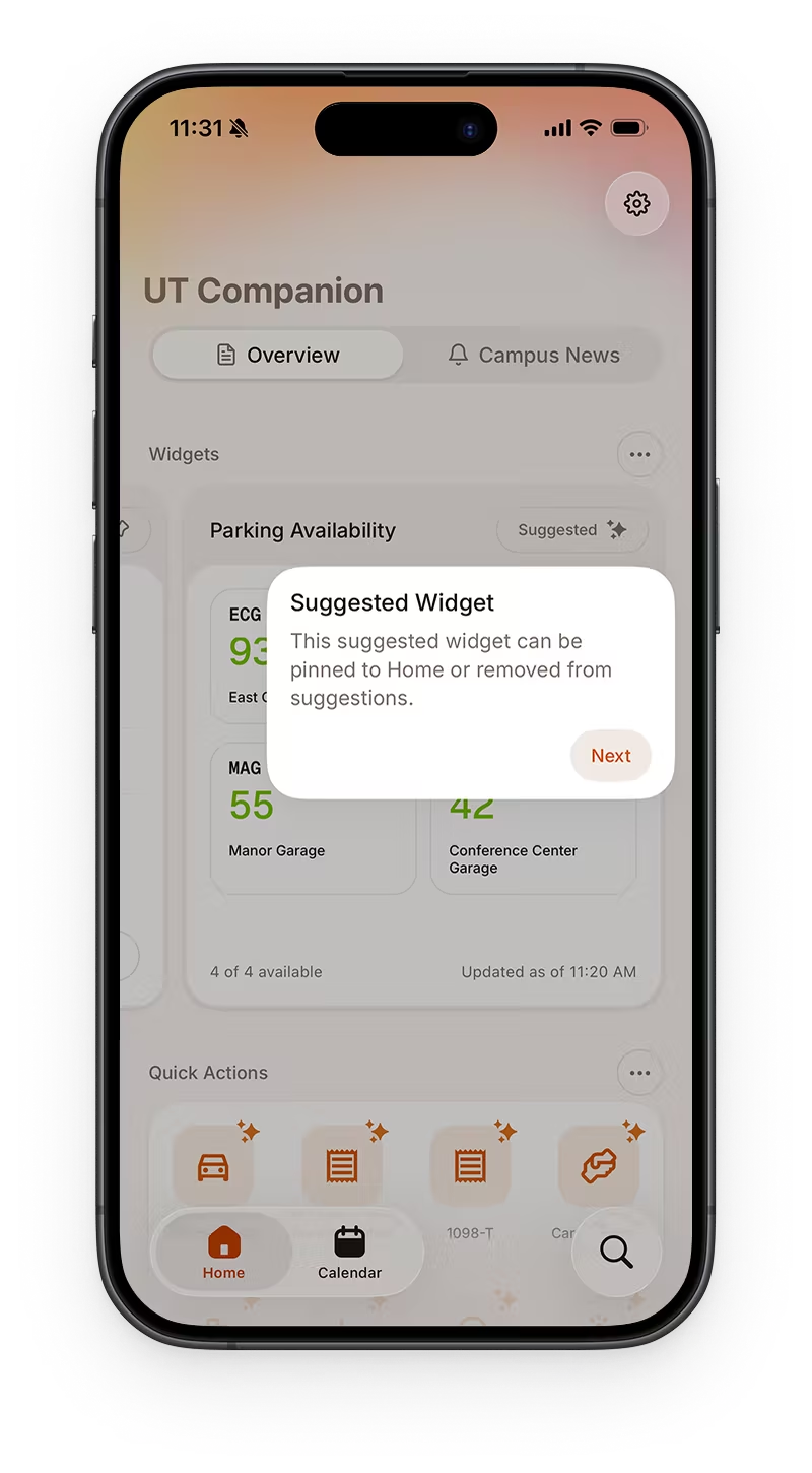
Parking, night travel, dining, events, and bus sit in a horizontal strip on Home. You can pin up to three, and time-of-day scoring fills the rest. Nobody found pin or hide on their own in testing, so the first run points at them.
Native iOS Parking widget
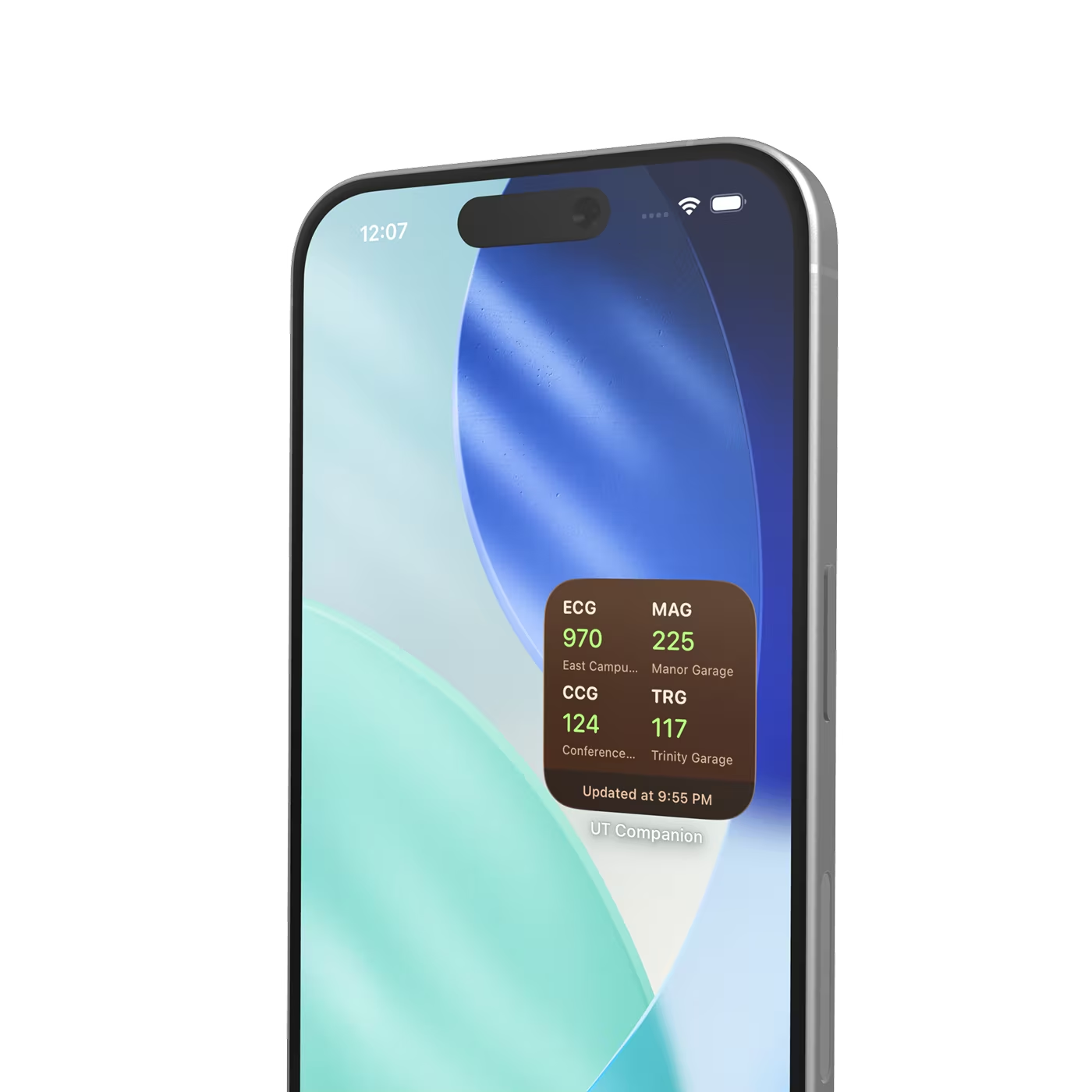
Only Parking ships as a real iOS home-screen widget, systemSmall, through expo-widgets and @expo/ui SwiftUI primitives. The view is React with a 'widget' directive. Almost no imports work inside that view, so colors, status mapping, and layout stay inlined.
const ParkingWidgetView = (props: ParkingWidgetSnapshot) => {
  "widget";
  // Almost no imports work here. Logic stays inlined.
  // ...
};

const ParkingWidget = createWidget<ParkingWidgetSnapshot>(
  "ParkingWidget",
  ParkingWidgetView,
);
The JS app does not run inside the widget. iOS fetches and parses garage HTML with cheerio, caches for fifteen minutes, then writes a snapshot into an App Group timeline:
ParkingWidget.updateSnapshot(
  filterParkingSnapshotBySelection(snapshot, selectedGarageIds),
);
Sync runs on launch, when the app becomes active, and when widget preferences change. Open the app once, and the home-screen tile can show garage codes and open-space counts without launching React again.
After class
Class ended. The App Store listing did not. A few features I shipped afterward are worth naming because they change how the companion behaves day to day.
Settings backup and restore, 2026-05-09. Native export writes a JSON envelope, shares it through the system sheet, and restores through the document picker. Web backup is still unsupported.
Forms directory, 2026-07-11. Fourteen curated official forms, grouped by financial aid, records, health, and specialized cases. Links point at durable One Stop, Grad School, and ISSS pages, not semester PDFs that rot every term.
i18n, 2026-07-12. en-US, es-US, and zh-TW, with the bilingual search index described above. That mattered for a campus where Spanish and Traditional Chinese show up in real student workflows, not only in marketing screenshots.
None of that turned Companion into MyUT. It made the unofficial companion harder to outgrow after the semester ended.
Still a companion
Three things came out of this that I would defend anywhere. We tried a context-aware layout that puts resources in front of students instead of burying them behind menus. We made search work by fixing the content schema, navigation, and labels underneath it rather than by making the box smarter. And an AI feature is only as good as the data it is fed, so the structure we built is the part that would make a future AI integration worth having.
If you want the research method, task flows, and testing tables, read the final report. This post is the public half of the story.
Download it on the App Store, or dig through GitHub. Credit to Hao and Taek for the design, research, and department work that made the engineering land. UT Companion still sits next to official UT systems. That is the point.